
In this new era of intensified focus on workplace design, color has become a significant consideration for both psychologists and major businesses and organizations. Color is one of the numerous ways we perceive the world around us, and we often don’t recognize how it affects so many of the decisions, perceptions and communications we have on any given day.
Consider this: you think about color while dressing for work, and you rely on colored traffic lights to lead you during your commute. Your memory is loaded with color, and you recognize some of the most prominent brands through color.
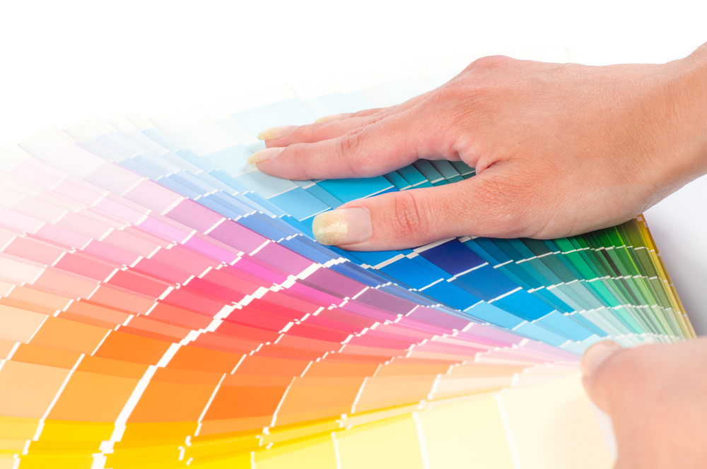
When you are choosing colors for your built environment, they shouldn’t be solely made based on individual inclination, but also through the understanding of the benefits that specific colors can produce.
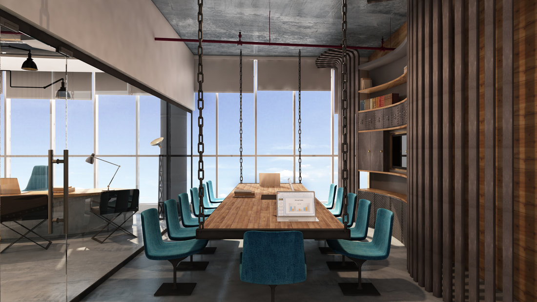
Several colors can positively contribute to happiness, productivity and even physical health in a workplace, so it is crucial to use them with the help of an office interior fit out company. Here are the top color guidelines for workspace design.
Can I Just Choose My Favorite Color?
Unfortunately, the answer is no. Selecting wall paint for your workspace is a far more intricate process than it may seem. Before you decide on a color, you need to consider the implications the color has and the emotions it may evoke from you, your staff and any clients or customers who visit the premises.
However, picking out a familiar or popular color is also essential to a certain extent. This is the reason why most company logos are made using a single popular color scheme or includes at least one popular color in the case of logos with more than one color.
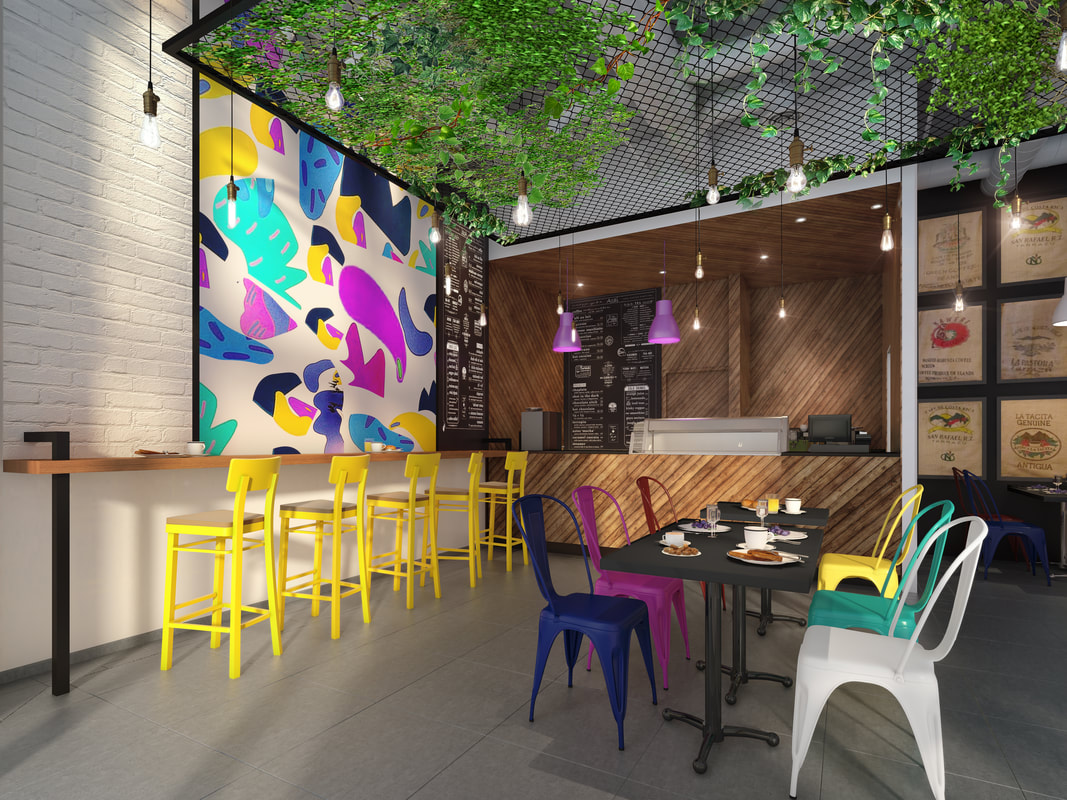
According to a recent study the world’s most favorite color is — blue! Followed closely by red, green and purple. On the other hand, pink, brown and black are the least popular colors in the world.
What Are the Psychological Effects of Colors?
While in our day-to-day lives we may not notice it, color affects how our bodies behave, and the shades you surround yourself with can influence how you work. When researching color schemes for your workspace, you should certainly take this into account.
First and foremost, there are four psychological primary colors: red, blue, yellow and green.
Red – affects the body
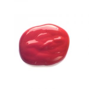
The color red is said to:
- Boost heart rate
- Increase brain wave activity
- Stimulate appetite
Red is good for spaces where people work at night, and spaces with a lot of physical activity.
Blue – affects the mind
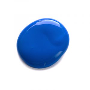
The color blue is said to:
- Calm people
- Promote a sense of security, communication and productivity
- Help lower heart rate, blood pressure and respiration
Blue is good for brainstorming spaces and detail-oriented spaces.
Yellow – affects self-confidence
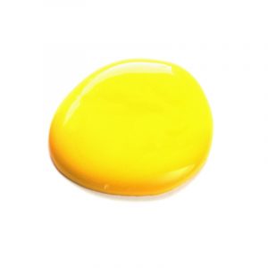
The color yellow is said to:
- Induce a sense of optimism
- Stimulate and energize
- However, too much can lead to anxiety and an increase in people’s temper
Yellow is good for accenting other colors and high-energy, creative spaces.
Green – affects the balance between mind, body and emotions
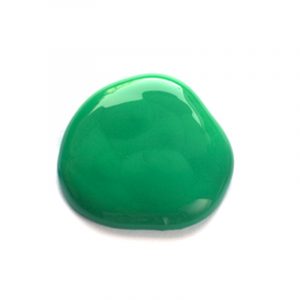
The color green is said to:
- Boost creativity
- Inspire innovation
- Promote harmony and balance
- Enhance creative performance
- Reduce anxiety
- Reduce eye strain
Green is good for innovative spaces, spaces where computers are used, and brainstorming spaces.
Other colors to consider:
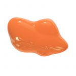
The color orange is said to:
- Symbolize endurance
- Boost creative performance
- Generate enthusiasm
Orange is good for accenting other colors and high-energy, creative spaces.

The color grey is said to:
- Be psychologically neutral
- Generate a lack of confidence
Grey is good for offsetting a brighter color such as orange or yellow.
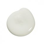
The color white is said to:
- Create a sense of spaciousness (especially when paired with natural light)
- Promote creativity
White is good for creative spaces.
What Else Should I Consider?
When selecting colors for your workspace, remember that not only does the shade change how the color affects the environment and its users, but also other variables such as translucency, sheen and pattern.
Additionally, the impact of a particular color also shifts when another color or group of colors is added to the mix. For this reason, much consideration should be given to color combinations as they can make or break the look of the overall environment. If you have questions about these combinations, reach out to an interior company.
Color is profoundly ingrained in our lives and influences our encounters in the world considerably. What was once merely a stylistic decision is now utilized as a tool to stimulate productivity and spark creativity in organizations.
Color improves everyone’s experience at work, and the right ones can positively affect your mood, concentration and stress levels. To achieve these objectives, it is essential to learn how different colors communicate with each other and with other components of a workspace such as lighting, patterns and textiles.
For these reasons, when designing your workspace, you should be sensitive to all aspects of color. Use it well to improve your workplace, and to impact everyday users of that workspace positively.
————-
This is a Guest Post from Shane Curran, CEO at Interact Group LLC. Interact Group is a design-led interior fit out company that aims to set new standards in the UAE interiors market. Driven by their dedication to total customer experience, the company’s mission is to bring truly specialized teams to complex design and fit out challenges, utilizing their unmatched ability to deliver spaces efficiently and above expectation.
Feature Image: http://www.interactgroupintl.com/acai-restaurant.html


