
What are the inviting colors for your house?
- Dusty Blue
- White, Terracotta, Moss Green
- Warm Beige
- Pink and Gray
- Navy and Taupe
Need some house color ideas? You can create an inviting atmosphere by using different colors of paint for your interiors and exteriors. This can be done by applying the concept of color psychology and popular color combinations. You can approach an interior designer or a paint expert to assist you with the finer details of your project and ideas.
Inviting colors can induce a comforting atmosphere, especially if you use the right combination of colors in your home. Try these inviting house paint colors for your interiors and exteriors.
Dusty Blue
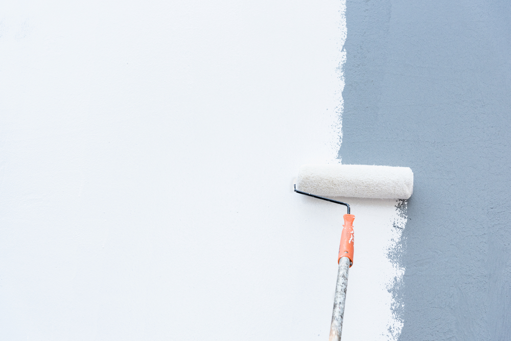
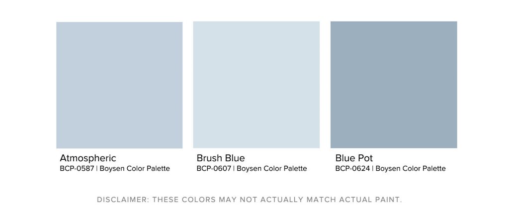
The color blue evokes feelings of clarity and order. Blue is a good color for rooms where you need to do a lot of thinking, such as study rooms or libraries. It can also be used for rooms where you need to relax or clear your mind. If you want an aura of serenity, this can be a good choice.
Dusty blue tones are somewhere in between blue and gray. The velvety nature of this color is considered neutral. It can be emphasized with white or it can look deeper with darker accents. This tone can be usable in a monochromatic palette as well.
White, Terracotta, Moss Green
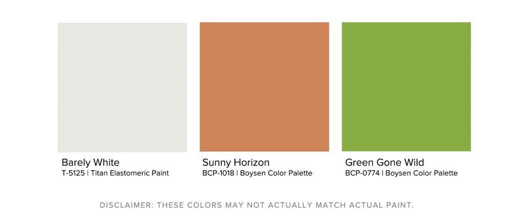
Green is a color that is highly associated with nature and is known to have a significant calming effect on people. It represents tranquility, luck, and health. It’s a color that can stimulate the mind. Dark moss green can be soothing when used for exteriors. Painting your exterior walls with this color creates an inviting feeling for your visitors. Avoid making it look muddy by combining it with white and clay tones. White helps create contrast, which is perfect for entrances. Terracotta and clay tones bring a warm aspect. This can instantly energize the exteriors without going overboard or overpowering the moss green color.
If your home is rich with flora, use the moss green to create a seamless look. Moss green colors look great in a lighter tone as well. Make sure your moss green remains on the cooler side of the spectrum to avoid making it look olive-toned. Reserve the olive tones for your interiors if you prefer to use them.
Warm Beige
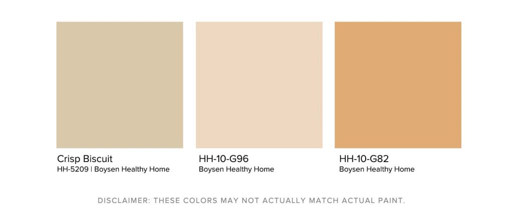
Awaken your interiors by using a warm beige that leans towards the orange spectrum. Beige is a tone that you can always depend on; it’s conservative and flexible. The neutral tone of beige is calm and relaxing, which makes it a color that you can use almost anywhere. The warmth of beige can be derived from the color brown, while the crisp coolness is from the white base that also has a soft undertone.
Orange is a blend of yellow and red. The energy of red and the joyful mood of yellow creates orange. Orange can symbolize enthusiasm and creativity. When you combine a very small amount of orange with white to make a beige tone, you create a color that carries positive emotions. It eliminates the overpowering tones of red and yellow to create a color that can work either in your home’s interiors or exteriors.
Place the warm beige in your kitchen or dining area since that tinge of orange tends to stimulate the senses. Entice your guests with this warm and inviting tone. It’s perfect for small gatherings and intimate dinners. This color also pairs well with a lot of other colors. It’s the perfect backdrop for the statement pieces you already have within your home.
Pink and Gray
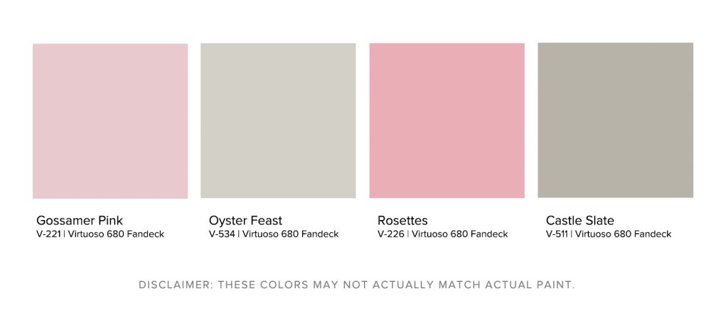
Pink is delicate and charming. It’s a universal color that represents affection, friendship, and approachability. Paired with the neutrality of gray, you can tone down the pink to your liking. Gray makes the pink formal, conservative, and sophisticated. Use this timeless combination for bedrooms and guest rooms. Your interiors can highly benefit from this sophisticated combination.
Choosing a lighter gray and pink leans toward the feminine side. It can pair very well with a white vanity set within one of your bedrooms. The pink is also able to reflect a lot of light. Make sure you choose a pink with a white base. Violet-based pinks tend to be harsh to the eyes. The softness of the white can balance your pink color perfectly.
Navy and Taupe
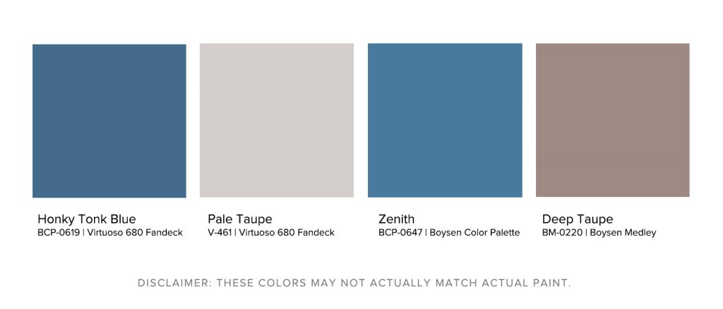
In contrast to the pink and gray combination, navy and taupe is a masculine choice. The darker navy instantly creates an engaging yet subdued blue color that is perfect for study rooms and offices. Taupes are an earthy color that is wholesome and dependable. When combined with navy, you create an inviting balance of colors.
This is a simple set of colors that can be used in other rooms as well. Use it in your living room for added sophistication. If you want to emphasize the furniture in your dining room, the depth of both these colors can enhance the overall look of your dining room. Remember to avoid pairing gray for your taupe as it can make it look dull. Look for a taupe with violet and brown tones. This can bring the taupe to life without making it look messy.
Key Takeaway
These colors are not only popular choices but they also evoke a positive and inviting atmosphere. Try these color combinations and create a unique look for your home. Boysen can help you achieve the inviting look you desire for your home. Visit a mix and match station today to find the perfect color for you!


