
This crystalline structure in Aoyama is Prada’s flagship store in Tokyo. One of their most iconic stores to date, it was designed in 2003 by Swiss architecture firm Herzog & de Meuron. Easily distinguishable by its structure and geometrical façade, this building has become one of the city’s architectural marvels.
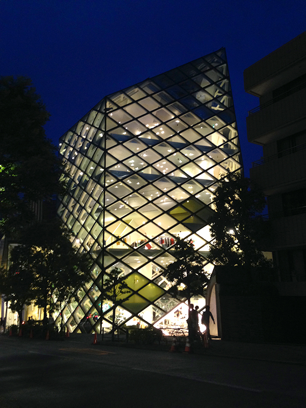
The building has a boxy base with an asymmetrical roof, making its shape look different depending on one’s viewpoint. The building’s exterior is simple yet fascinating and eye-catching due to the symmetrical grid formed by the glossy glass windows and aluminum frames. The frames you see from the outside, work as the building’s skeleton, creating the structure and providing support in addition to being one of the distinctive elements of the façade.
The façade is conceived as a porous spatial structure: one could almost say the building does not even have a façade. Its glazing is only an external shell, comparable to a contact lens resting on the pupil of an eye.”- Prada
The windows are glazed and have a slight green tint to them. They are thick and semi-transparent, consisting of a mix of convex, concave, and flat glass panels. The combination creates a distorted effect when the viewer looks to the other side of the window.
These differing geometries generate facetted reflections, which enable viewers, both inside and outside the building, to see constantly changing pictures and almost cinematographic perspectives of Prada products, the city and themselves.”- Herzog & de Meuron
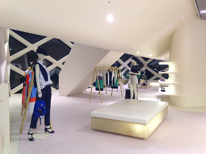
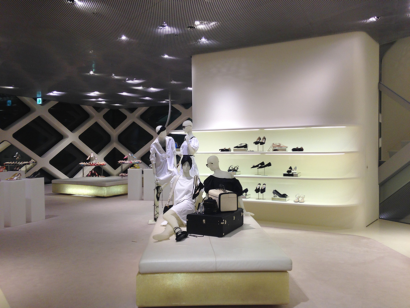
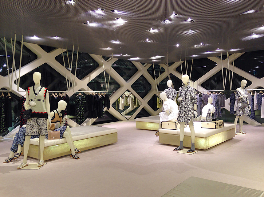
Inside, you notice that the interiors almost lack angularity. The contours of the shelves, tables, and floors are fluid and rounded, similar to the wax in a lava lamp. It seems as if these are all extensions to the building itself. The aluminum frame is encased with silicon inside the building making it thick and three-dimensional. According to Herzog & de Meuron’s website, the materials used in the building are “hyper-artificial, like resin, silicon and fiberglass, or hyper-natural, like leather, moss or porous planks of wood.” Everything inside, except for the clothes and the couches, are completely snow-white. The interior looks meticulously spotless and perfectionist, a perfect fit for a store selling Miuccia Prada’s creations.
I was there when the Spring/Summer 2016 collection was being sold, and it was interesting how the stark-white interior complemented the pale, subdued color palette of the collection. It did not drown the clothes, as I thought it would, but instead it enhanced them. Completely unrelated to interior design, but I also loved the dramatic mannequin placement – although Prada always excels at that.
Located nearby is the Herzog & de Meuron designed store of Miu Miu, Prada’s sister brand. Prada is often involved with architecture, collaborating constantly with Rem Koolhaas during their fashion shows, in their Soho store in New York, and in their museum, the Fondazione Prada in Milan. Unfortunately, I didn’t have time to go inside the Soho branch when I was in New York but I plan on doing so the next time I’m there.
In terms of architecture, this was my favorite stand-alone store I visited in Tokyo, even if I only saw it at night. Even if you’re not interested in buying anything, it’s still worth going to for the architecture. Take a look inside, examine the details of the building, and appreciate the creativity of the team behind Herzog & de Meuron – and not to mention the creativity of Miuccia Prada.


