
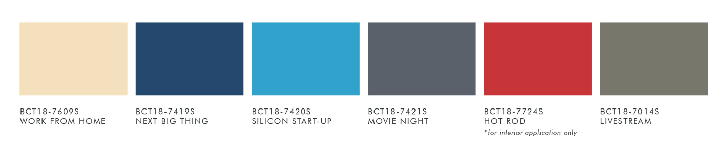
You’d think that the palette Be Seen, mainly consisting of blues and greys, would be subdued and restrained. However, the addition of a fiery red and cream makes it hum with a kind of sassy energy. The color combination makes it a space that vibrates at a higher frequency. It’s a space that invites you to show the world your light.
Paint Your Dining Room with Be Seen
Tom Castañeda, assistant vice president of SM Home, designed a nautical-themed dining room vignette. Nautical was not the style he wanted for this room, not until he saw the striped wall. He started out with blue and cream, and ended up adding red stripes in the whole mix. See for yourself in this video what Tom made of the space.
The colors in this dining room raise energy levels. This is a good ambience for a dining room since it is a place where family members meet. If you are the type to enjoy having people in your home, this is definitely a place where you can hang out.
We will be making videos of the other two palettes in Color Trend 2018, Be Here and Be You. In the meantime, you can go check out the five room sets in the bridgeway at the 5th floor of SM Home Makati. You will find ideas on how you can use the four new palettes in a home office, dining room, home office, kitchen and bedroom. The vignettes will be there until the end of March.


