
Another color palette in Boysen Color Trend 2022/23 is BLOOM. It is a surprising and sophisticated paint color palette that is made up of mostly vibrant colors. The mix is unexpected but the colors can work well together.
This color palette is for the bold among us. Most people would rather have neutrals or pastel colors painted on their walls. Except for the light pink Candies Be Love and the pale Wistful Lilac, the other four are vibrant colors of mustard, teal, red, and pink.
We equated the BLOOM color palette with the natural element earth. After years of being in a seeming limbo of lockdowns, quarantines, and changing protocols, we need to ground and reorient ourselves so we know better where we should go. But more than that, the times are calling for us to be more experimental and more innovative. The environment may seem dismal, which is why we need to look into ourselves to find that energy and boldness to find our way to better times.
Renewal. Notion of Redo.
Ambiente Frankfurt, the world’s largest trade fair for products for living, dining, and giving, launched the Notion of Redo, which pushes sustainable living through upcycling design. It features “stunning creativity, excitingly combined materials and a colour palette for the bold and determined.”
As to Ambiente’s Trend Colors 2021 which are intense and vivid, designer Claudia Herke from stilbüro bora.herke.palmisano has this to say: ““A colour palette for the bold and determined that makes us want to bring about positive change.”
This is what the Boysen Color Team also is saying with the latest Boysen Color Trend 2022/23. The color palette BLOOM is a good example of using color to create positive vibes in the home.
BLOOM Color Palette of Boysen Color Trend 2022/23
At Boysen, we too are rooting for bright and vivid paint colors for the home. And like Ambiente, we say that despite, or maybe because of, the challenges we all are facing today, “revival and rejuvenation” are what the world needs.
BLOOM where you are planted!
Here are the colors of BLOOM as expressed by flowers:
Wistful Lilac | BCT21-7434S
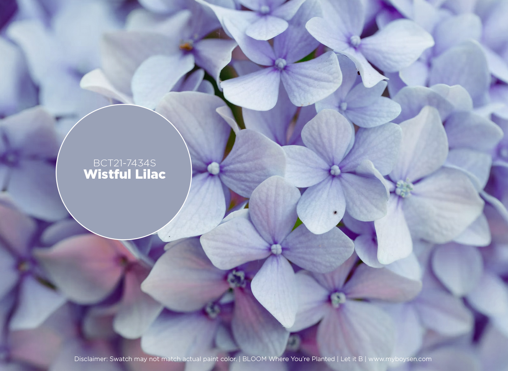
An informal survey showed that some homeowners are so done with gray. Wistful Lilac is a good alternative. It has light blue and pale violet tones with an undertone of gray. This very restful color can be perfect for bedrooms. In the language of flowers, lilacs symbolize tranquility, spirituality, and happiness. They are known for being hardy bushes that can live more than a hundred years. If there’s a talisman we need in these times, that’s lilac to inspire us to awaken the robustness to endure inauspicious conditions.
Honey Hive | BCT21-7617S
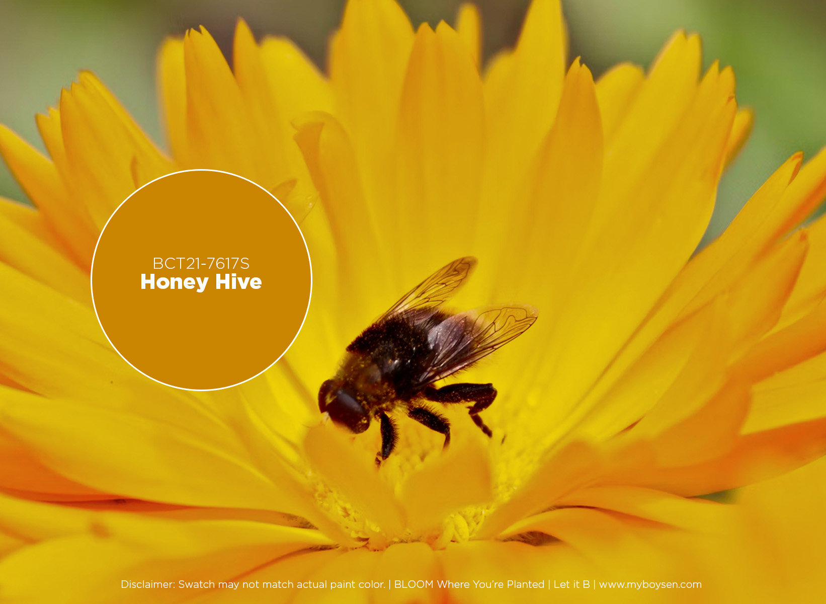
Honey Hive is a deep yellow like mustard. Bring some sunshine into your home with this paint color to create the energetic vibe that would help us get on with life in a cheerful way. Read about the different intensities of yellows in this post.
Teal We Meet Again | BCT21-7435S
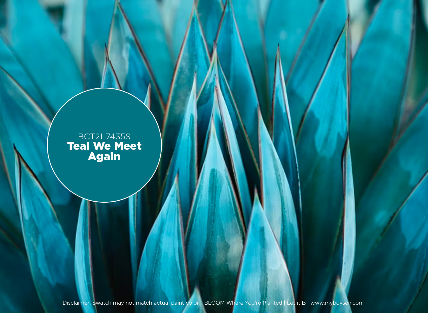
Teal We Meet Again is a dark blue-green color that can add drama to your living spaces. If you want a dark color to paint your walls with, this is it. Dark colors are often associated with modern and sophisticated interior designs. You can balance it with light neutrals on some surfaces or furniture pieces, including your floor, so you won’t feel too overwhelmed, more so if this is the first time you venture into a color this bold.
Whirlwind Romance | BCT21-7436S
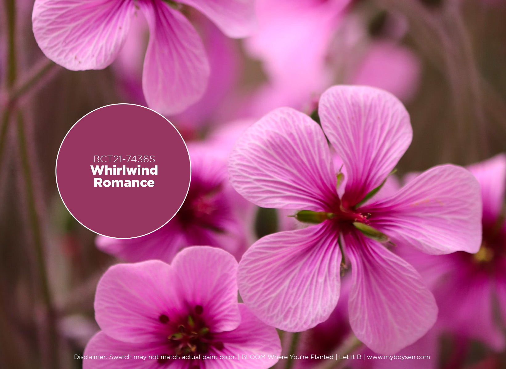
Despite this being a deep pink, Whirlwind Romance works not only in feminine spaces, but can also work in masculine homes because of its intensity. There’s a lot of red in this color but blue is also high in the mix. This color can go very well with Sweet Inspiration, Candies Be Love, and Wistful Lilac.
Sweet Inspiration | BCT21-7437S
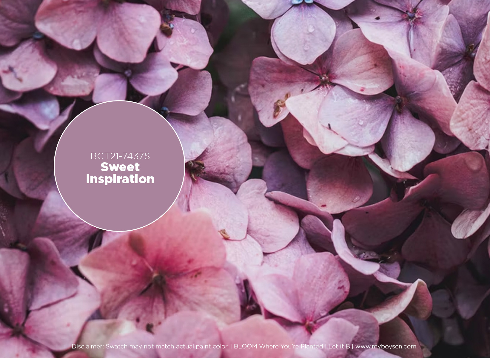
Sweet Inspiration is a color you see a lot in fashion and makeup today. This hue looks good next to the skin which is probably the reason why it is becoming a trend. So why not on your walls too! It’s bright and could softly illuminate a space. It cocoons and embraces instead of standing out. Pair it with Wistful Lilac for a monochromatic look.
Candies Be Love | BCT21-7738S
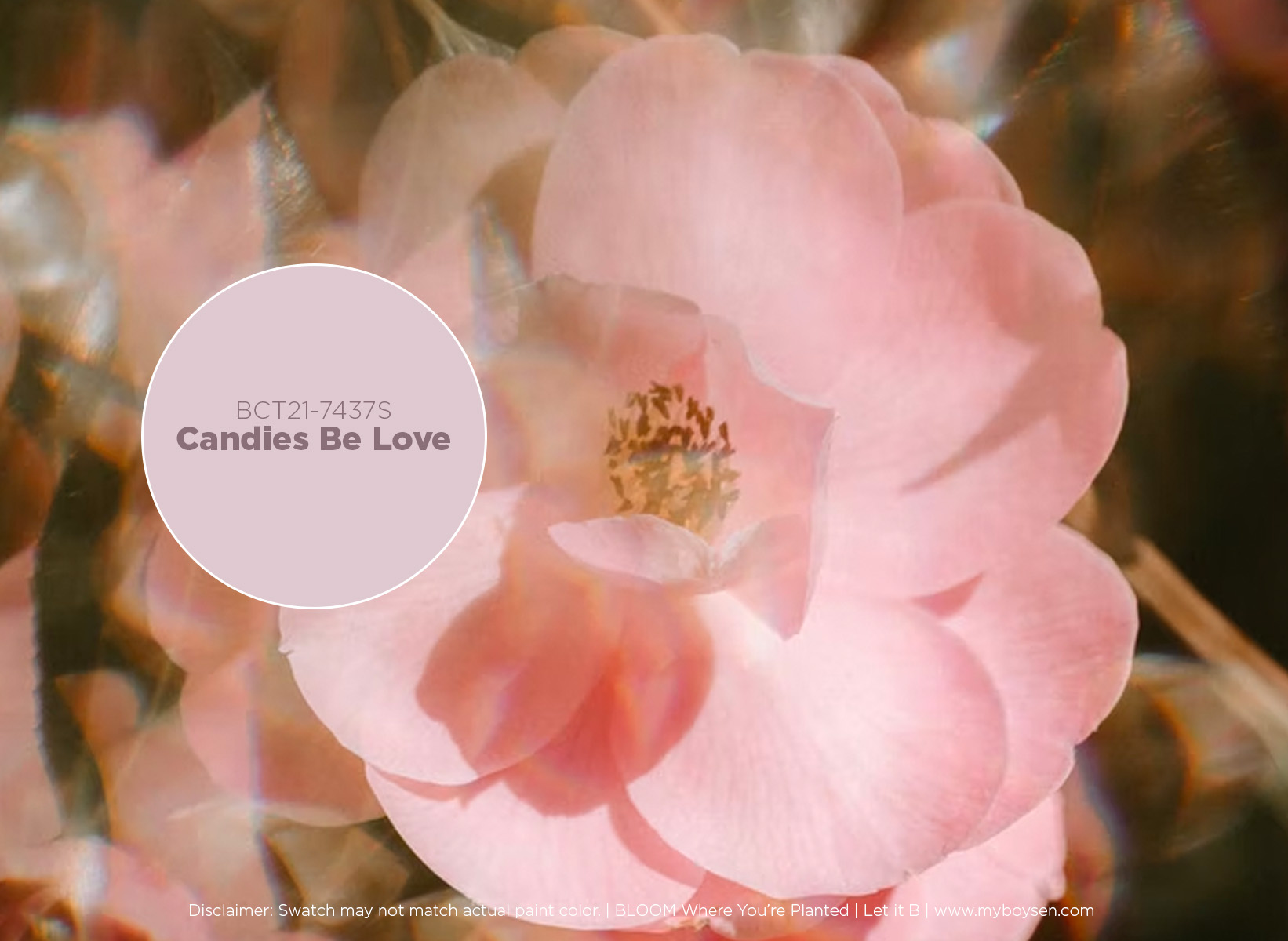
Candies Be Love is pale enough to paint in most of a room’s walls. The light pink hue can also look good with other darker hues like Whirlwind Romance and Sweet Inspiration. For a more restful combination, Wistful Lilac would be its perfect partner. These pastels don’t look too saccharine and would look right at home in rooms for grown-ups.
Read more about the other color trend palettes in the website.


