I went to IKEA last weekend and felt excited when I saw the bright blue and yellow logo. IKEA is a personal favorite and I can spend hours in one. I wanted to check out this Manila branch, as well as buy some dish towels. I ended up with much more than dish towels after going around the store for four hours with a friend who, like me, wanted to examine every corner. He had way much more discipline than I did but ended up anyway with dish sponges and bowls that he didn’t need. As for me, I completed the round with this heavy bag of things despite the constant drone of Marie Kondo’s (for those of you who don’t know her, she’s famous for her tidying method) voice inside my head. The only thing of hers that I listened to was, “Does this spark joy?,” as I held up one item after the other. And the answer was always a resounding yes.

Bright Blue and Yellow
The bright blue and yellow colors are iconic not only to iKEA. Since late last week, we’ve seen these same colors on Ukraine’s flag. The world has been turned upside down with the events of the last few days. Millions of people, not only Ukrainians, but almost everyone in the world, are affected in some way or another by a single act. How, you may ask? For us in the Philippines, it is the increase in fuel prices which has a significant impact on food prices, but that is just the tip of the iceberg. If we need more proof that we are all connected, this is it. The Dalai Lama put it this way, “Just as ripples spread out when a single pebble is dropped into water, the actions of individuals can have far-reaching effects.”
Blue and yellow are primary colors. Yellow signifies happiness, joy, hope, and optimism, among other things. Blue stands for wisdom, serenity, bravery, and peace, to name a few. Blue and yellow combined gives a happy and uplifting feel to a space. This is why it is a well-loved color scheme when designing interiors.
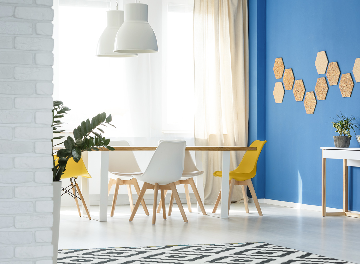
When using these two primary colors in a space, remember that this color pairing is extremely high contrast. Using only these two would create such a strong energy that it may not be inviting and relaxing to stay in the room. A way forward would be to revisit the 60-30-10 rule of interior design.
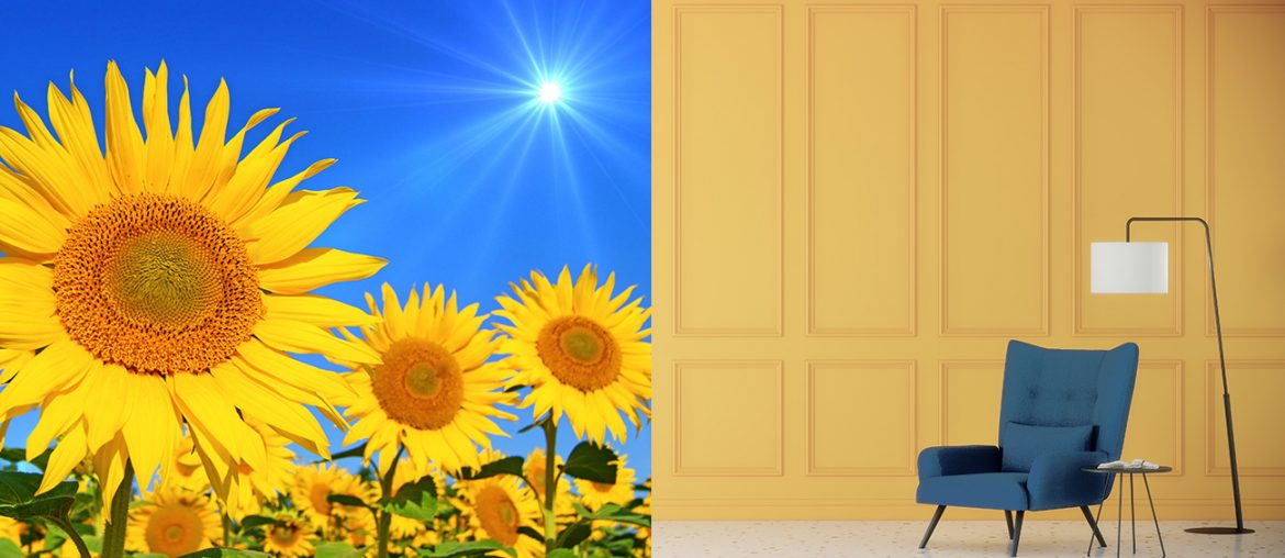
This basic interior design rule deals with three colors. To make it work, bring in a neutral color where the eye could rest. Choose this as the dominant color, or about 60% of the room. Let the 30% come from relatively bigger surfaces in the space. For a living room, these would be the furniture and rugs, for example. Or an accent wall like in the above photo. The remaining 10% will be your accent color. It will bring in the extra zing that you want in the space.
No Place Like Home
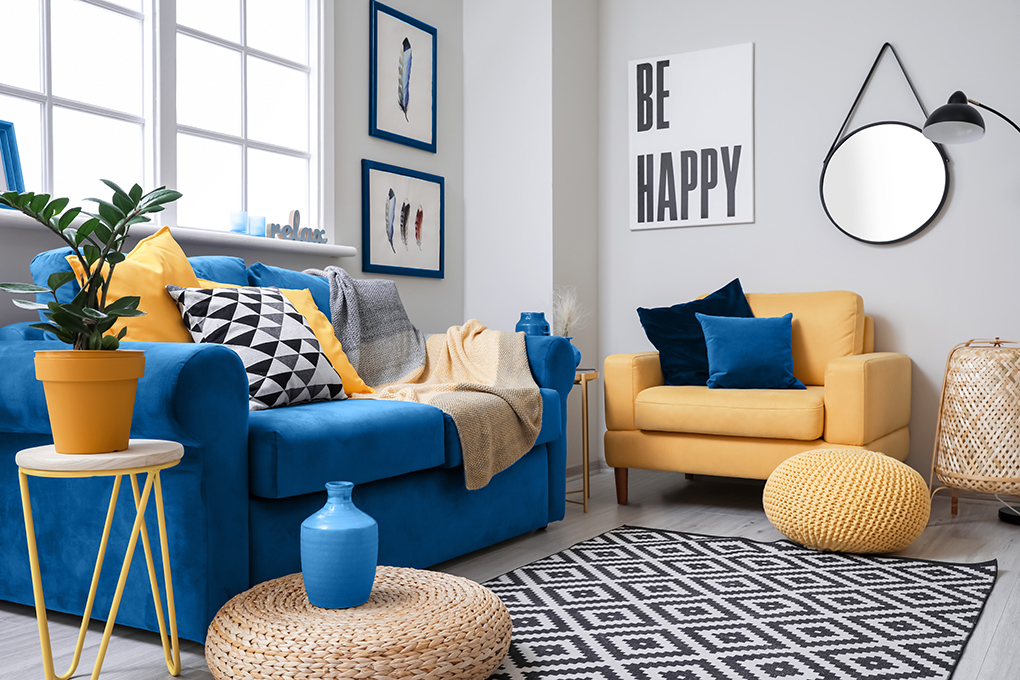
Most of us cherish our homes. It is a place to rest, where we feel safe, secure, comfortable, and loved. Many of us have felt the challenge of keeping our homes through this pandemic or through recent natural disasters. What do you think we’d feel if we were forcibly displaced because of violent and terrifying circumstances?
I cannot see bright blue and yellow in the same way again. To me, it is not only cheerful and refreshing, it has also become a symbol of a people taking up arms to bring back their peaceful way of life. It seems fitting that they consider the sunflower as their national flower. There are golden fields of them that face the east when the sun rises. Sunflowers symbolize unwavering faith and unconditional love, which they, and also we, need at this point in our collective history to get us through these times together.
Let unwavering faith, unconditional love, and peace follow you through your days. Please send these thoughts out to the world, and let the ripples of positive energy emanate from you to help heal the world.
For a dose of colorful inspiration, join our community here in Let it B by hitting the subscribe button above.

