
Internet is full of color palettes, color swatches, or color combinations, if you know where to look. That’s one of the advantages of this age—search engines are our friends. So are social media channels like Pinterest, Instagram, or YouTube. Our own Boysen Facebook page is full of color swatches. We sometimes like to get more creative than just making a color swatch and sticking the paint name and code on it. We’ve chosen 8 of them for you to consider.
The paint swatches are from the colors carried in our very first Boysen concept store The Color Library. If you don’t know what that is, you’re DMO (Definitely Missing Out—I made that up just in case you’re wondering).
Are you in a serious search for dream paint colors for your home? Go visit and have a fun time browsing through the Colorbooks. Talk to the Boysen Color Consultants about the 1,320 colors that were handpicked from the thousands of Boysen paint colors. The Color Library is very close to IKEA in MOA Square so make a creative day for yourself by visiting that shop too. Just make sure you bring a list, otherwise you’d end up with a cartload of stuff you never even considered you’d need (or maybe I’m just projecting).
Back to our creative paint color swatches. Here are just 8 of them which we posted in our FB page.
Dancing Sea | BCP-0641
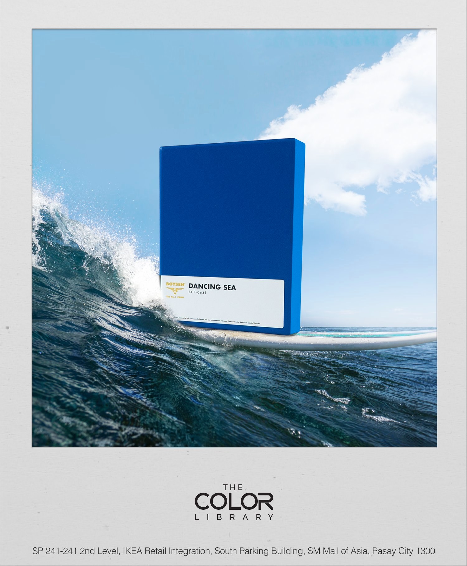
We celebrated World Ocean Day with Dancing Sea. This color is perfect, and not only for beach houses or coastal style homes. Deep, bright blue like our seas, Dancing Sea is a versatile color that can go with many others. Pair this with browns and you’ve got something low key but still exciting. If you want more energetic interiors, you can go for blue’s complementary color orange. Do you want it more zingy, go for canary yellow. If you want serene and peaceful, pair this blue with green. Combining it with white creates a crisp nautical feel. The list of color combinations can go on and on so keep this color in mind if you want flexibility in decorating your home.
Sweet Buttermilk | BCP-1021
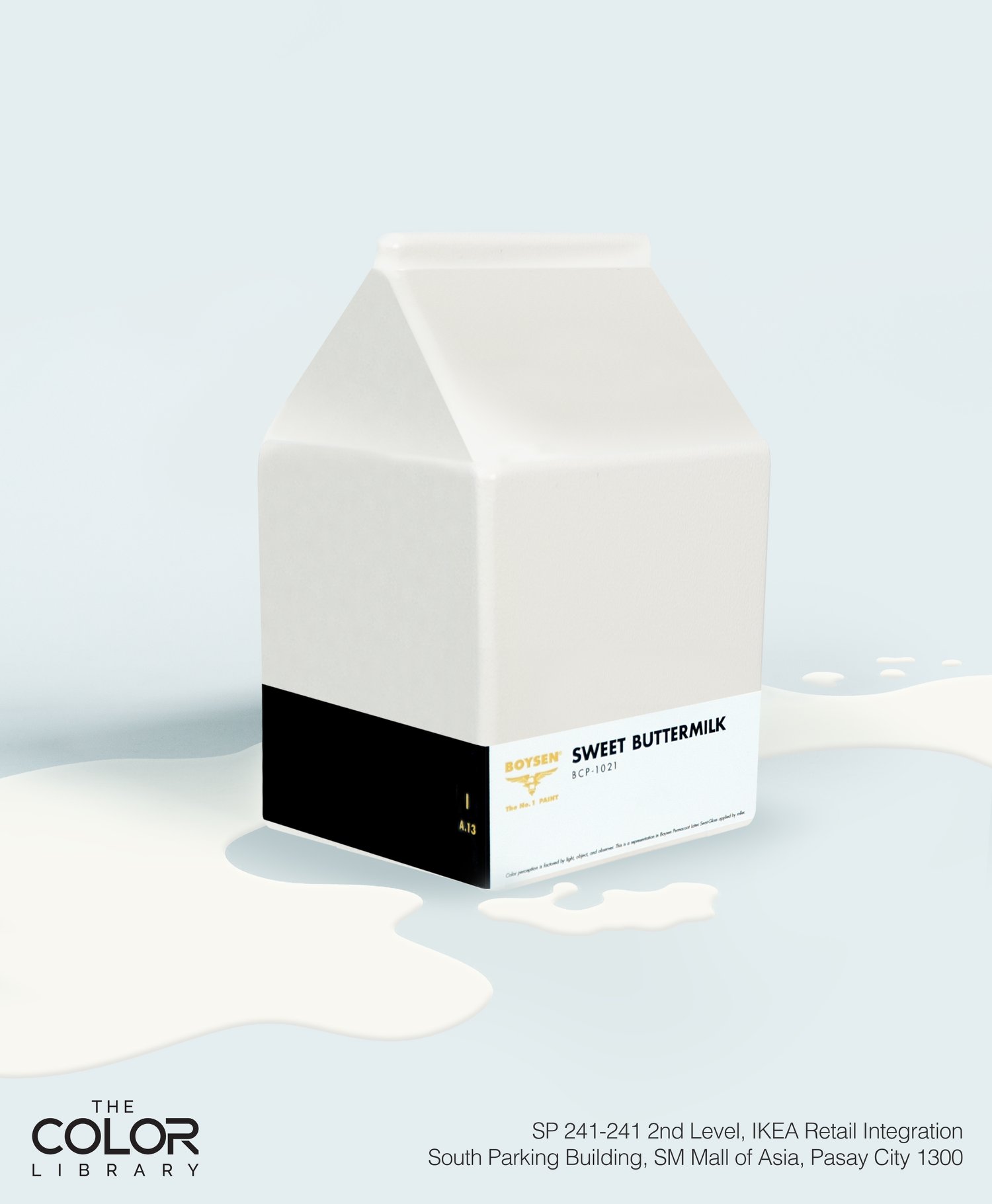
World Milk Day dawned with our very own Sweet Buttermilk greeting the day. This color is a light neutral, and as such, it can go pretty much with everything. Paint all rooms with it to create that feeling of continuity as one moves from room to room. If Dancing Sea is versatile, this is even more so. As backdrop or main event, you can never go wrong with Sweet Buttermilk.
Smokescreen | BCP-0556
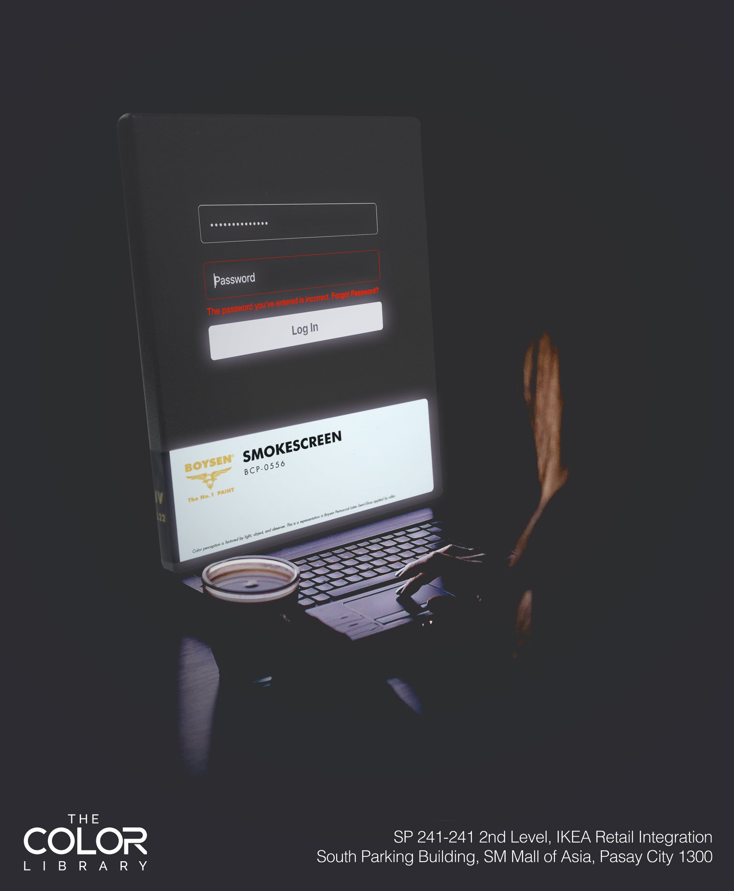
Smokescreen is a neutral color too, but a dark one. This is our symbol for World Password Day. Bet you didn’t know there’s a day for that…unless you are a cybersecurity professional concerned with good password habits to keep your online accounts safe and secure. Consider this color if you are decorating your very own game room where you want it dark and comfortable as you move around in different virtual worlds. You can also use it for your accent wall or trims or pair it white for that classic black and white aesthetic. Check out these interiors and see if these appeal to your inner diva.
Cactus Valley | BCP-0752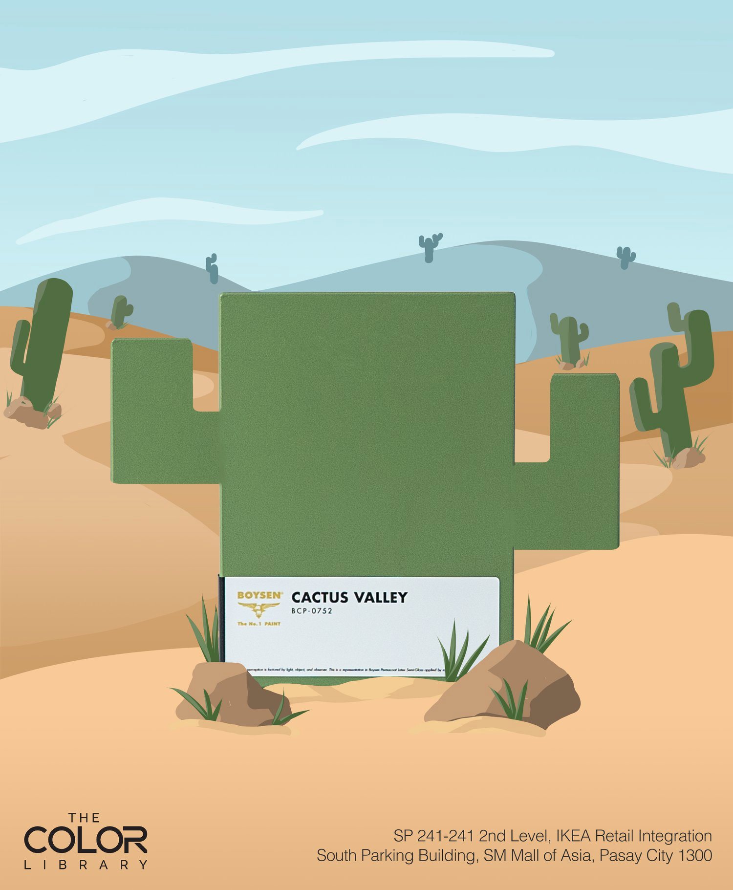
Succulents have been having their time in the sun and the limelight too. Supposedly easy maintenance, they’ve been collected, presented, coveted, posed, and even offered as wedding or corporate giveaways. We have our very own succulent right here named Cactus Valley. You can enjoy its glory in the safety of your home. Without the spines. Green is such an organic color, and relaxing as well. Paint your home interiors with this and enjoy the coolness while the sun shines hot and bright outside.
Sun Splashed | BCP-0932
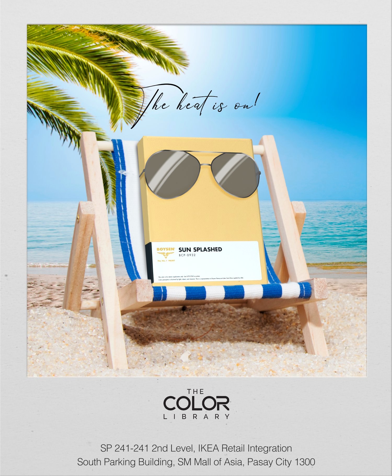
Talk about sun, we’ve got one for you. Sun Splashed is not hard-edged. It’s comfortable and not too hot of a yellow. But it will still certainly brighten up any dark corners in your home. Perfect for places where people congregate, this yellow color can bring the room’s energy up a notch. Think of fun and laughter, the kind that floats in the air and drenches a place with happiness, just like a sliver of sun.
Tantalizing Tan | BSGV1-104S
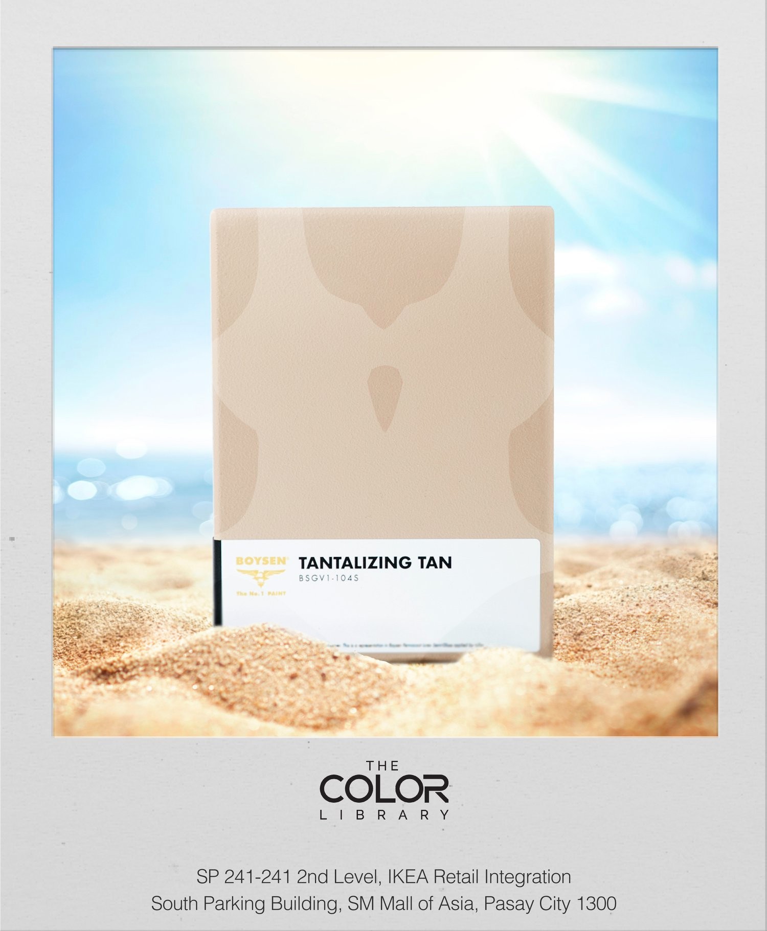
Where there’s sun, there’s tan. This is just a touch of color like a tan you get when you go outdoors before 10 am and after 4 pm. Just a tinge to be described as sun-kissed and not sunburned. That’s the kind of effect this light brown color would have in your home. Tantalizing Tan is a light neutral that can bring an inviting warmth to your interiors. Being a neutral hue, this would be very easy to combine with other colors. You can go for a monochromatic color scheme and have other colors that go a little bit lighter and darker. Such a scheme will always make your home look soft and elegant. See some examples of interior spaces with similar neutral hues.
Coffee Shop | BCP-0151
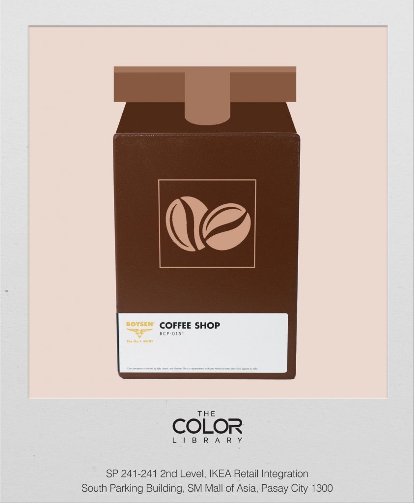
We chose Coffee Shop to represent Irish Coffee Day. Just like Irish coffee, this brown color is deep, rich, and strong. Brown has always been a favorite of interior designers, especially for spaces that need to exude a feeling of masculinity, wealth, power, exclusivity, and tradition, like man caves or gentlemen’s clubs. But brown can be feminine too, just like Mother Earth in all her fecundity. Did you know that brown has been chosen by interior designers to be 2022’s trending color? So while you’re sipping that Irish coffee ruminating about what paint color to coat your walls with, think about Coffee Shop.
Pretty Parasol | BCP-1039
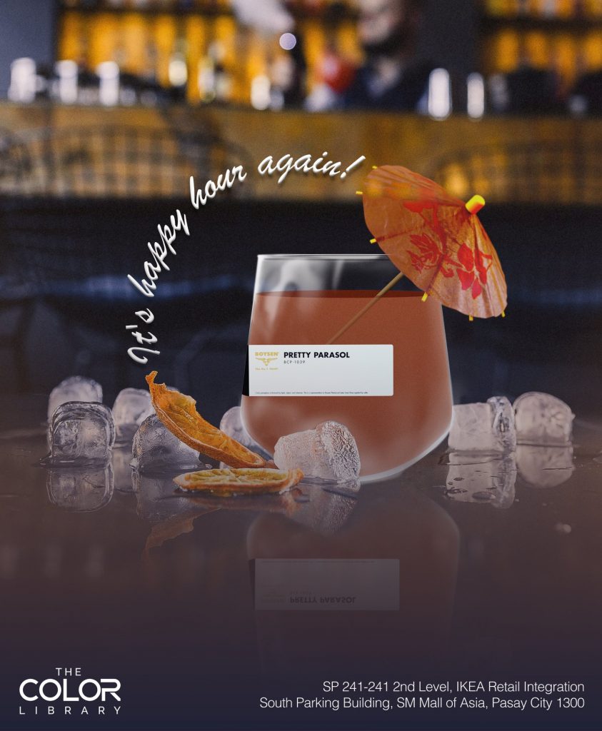
Fancy that! There’s a World Cocktail Day. I didn’t know, but I do approve. Not all cocktails come with parasols, but this orange brown color called Pretty Parasol has it in its name. This hue is one that gives an effervescent effect to anyone’s mood. Not too bright to get dazzled but still bright enough to sit up and take notice. Warm and earthy—this is the mood that Pretty Parasol can bring to a space, like a flirtation rather than a vampy come-on. Warning: Drink in moderation to keep the buzz light and easy.
Visit The Color Library and ask to see the Colorbook (swatch) of the paint color that you are considering. Although fun like these 8 swatches, digital representations of colors may differ from the real thing because of differences in screen settings. It’s so much better to hold the color swatch made of thick MDF board that has been properly primed and painted before making your order.
There will be more of these fun and creative paint color swatches so follow our social media channels by tapping on the icons at the top and bottom of this page on your screens.


