
January is over, the first month of the year has gone. February is here and I’m placing the spotlight on paint colors that are dainty and delightful. If you’re feeling tense and stressed, this is where you need to be. Get nestled in comfy colors to remind yourself that it’s okay to let go and let things be sometimes. Relax for a bit and dive into these soft hues.
Note: All the paint colors below are available for mixing at Boysen Mix and Match stations (find a list of locations here). Remember to take a look at the swatch of your chosen color in person before having it mixed.
Ballerina
BM-0015
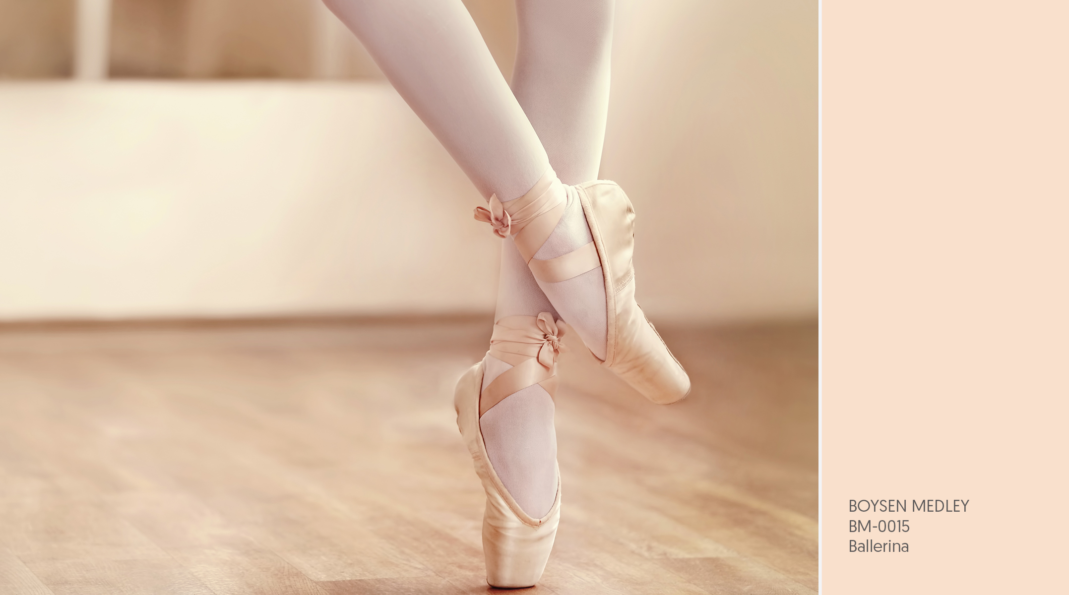
What could be daintier and more elegant than a ballerina? Audience members watch in awe as ballerinas dance gracefully on stage—their movements fluid and seemingly effortless. Behind every step, however, is years of hard work and perseverance.
Dedication to their craft and steadfastness in pursuing the best of their abilities make ballerinas, both female and male, more than worthy of our admiration. They are both dainty and strong. May this color remind you that strength manifests in myriad ways. There are many ways to be strong; find yours.
Cotton Ball
BCP-0007
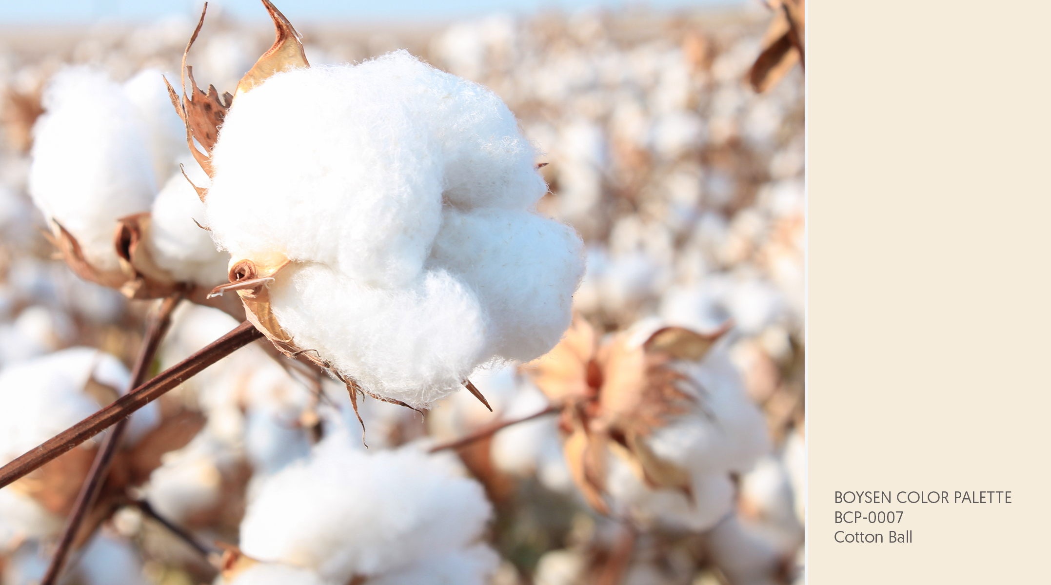
This paint color is as soft as what it was named after. As a neutral color, Cotton Ball is approachable and versatile. It’s cozy and inviting, like sinking into freshly laundered bedsheets after a long day.
Skin tone colors like this are great alternatives to white. If you find white walls too harsh, definitely consider beiges and softer browns. Some may say that these colors are bland and boring but Let It B stands behind what it has always said—it’s all in how you work with the color. With the right color combinations, no color is unappealing. Find inspiration on how to use colors like Cotton Ball in your home here: If You Don’t Like White, Try Skin Tones.
Petals Unfolding
BCP-1092
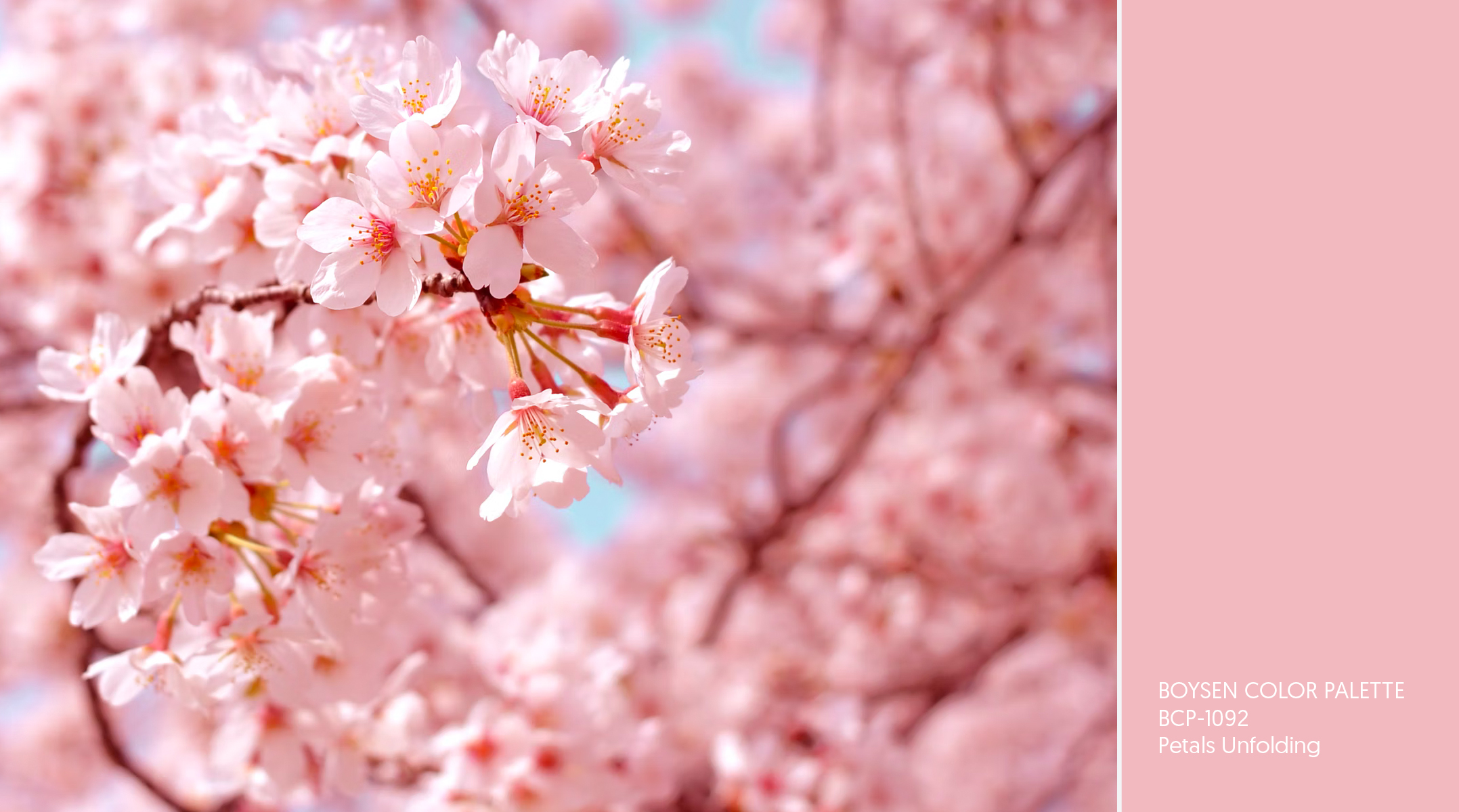
Bloom to your full potential. See how stunning you can be just like this pink hue. Though most often associated with femininity, pink can be striking, bold, and empowering.
Pink has been shown to lower aggression and stress but also makes a statement. It’s an attractive color that packs a punch. Express yourself without fear because color has no gender. If celebrated film director Wes Anderson thought it the perfect color for The Grand Budapest Hotel then why not use it at home too, right? Find pink inspiration here: #TeamPink: Empowering Blush Hues for Interiors and Tickled Pink: Blushing Hues for Exteriors.
Lemon Sponge Cake
BCP-0832
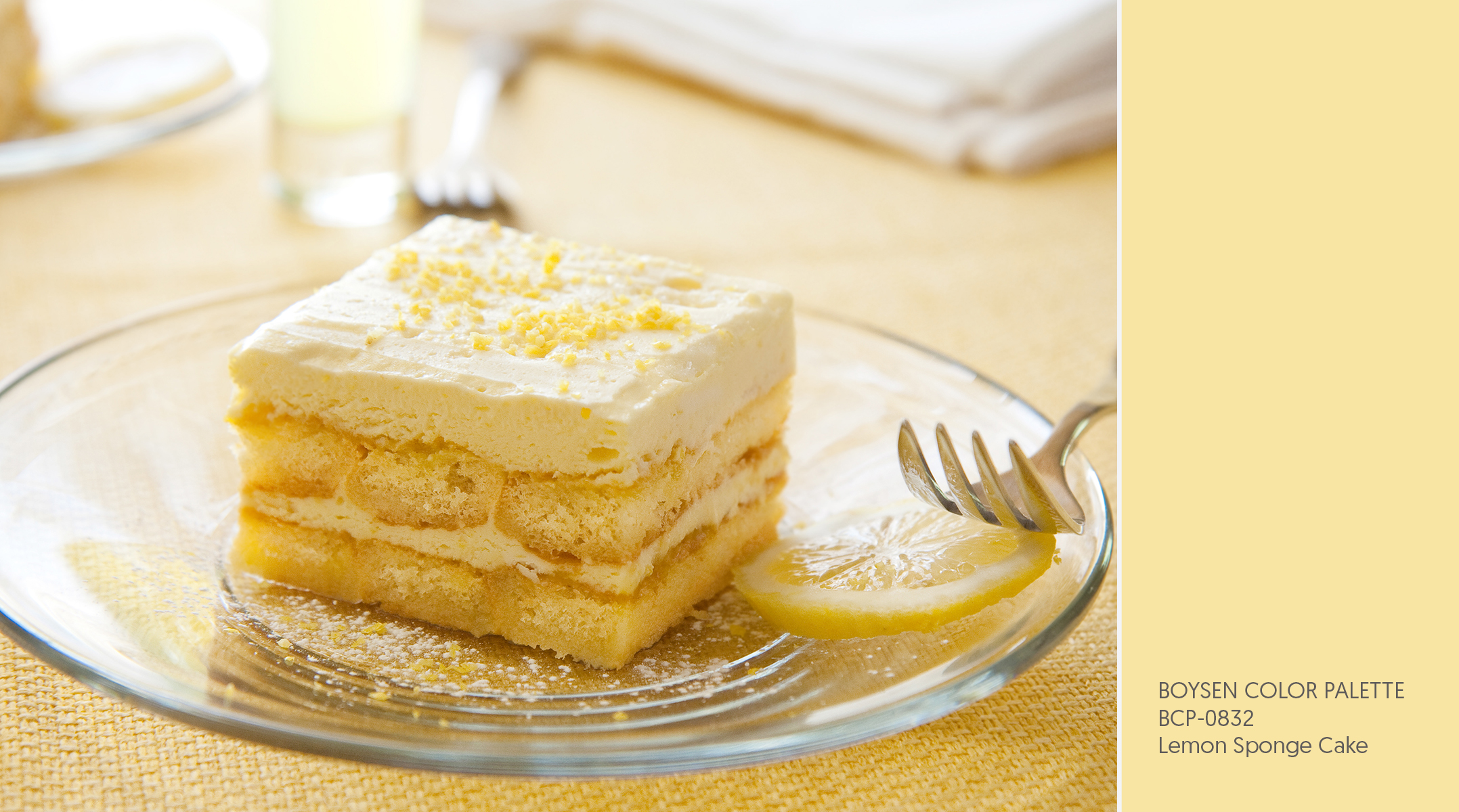
Imagine yourself on a picnic with loved ones on a cool, cloudy day. You lay down the picnic mat on the green grass. From the picnic basket, you take out sandwiches, biscuits and cookies, sliced fruit, and a small, beautifully decorated cake. How it stayed untouched and perfect is a mystery but thankfully it did.
It’s hard to stay gloomy when presented with a slice of cake, especially if it’s in a delectable mellow yellow color like Lemon Sponge Cake. Yellow is a happy color even in its more subdued shades. I love how this one isn’t too overbearing with its soft, warm glow. It’s almost irresistible.
Lavender Bliss
BCP-1252
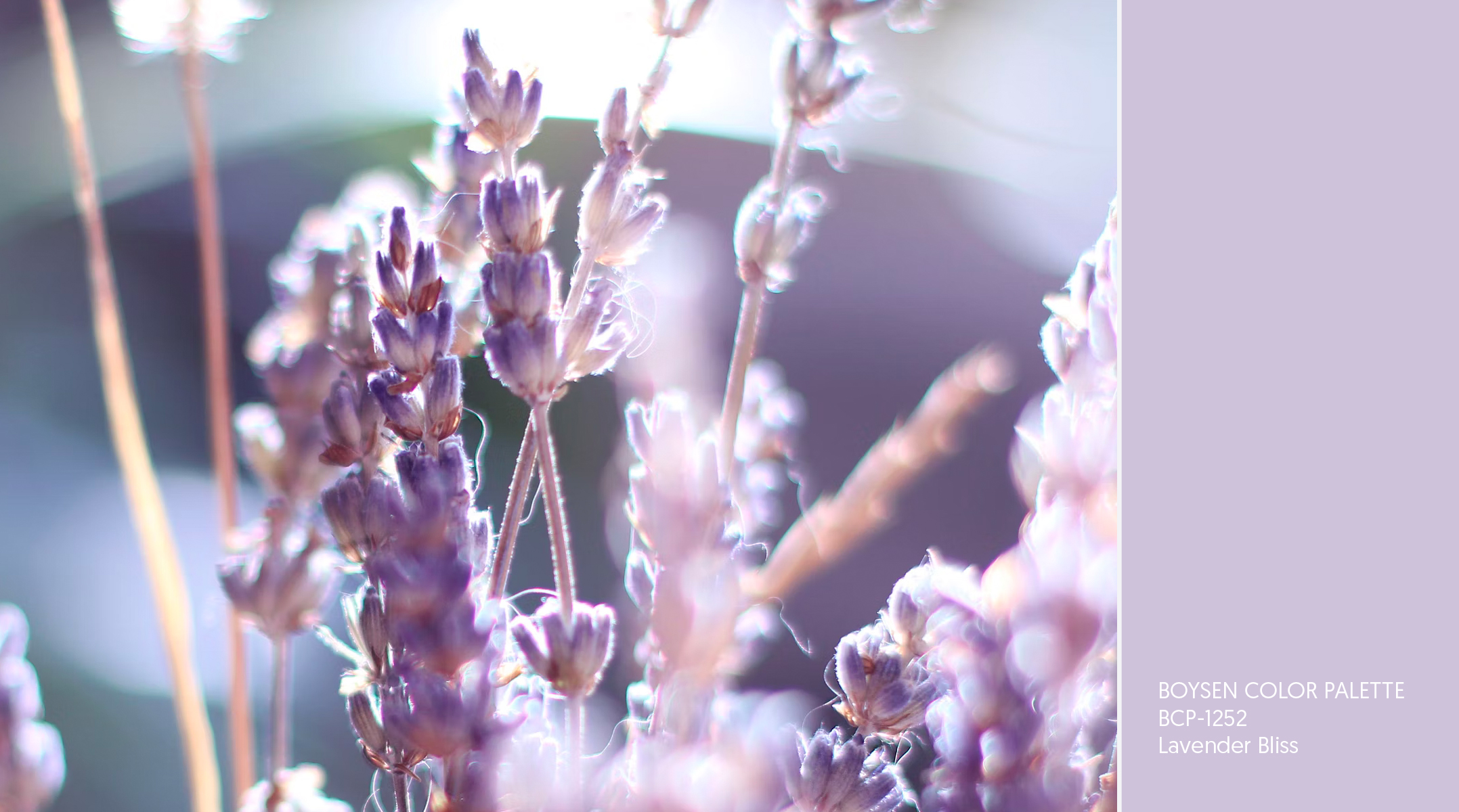
I have a preference for certain scents and, with me, the softer the better. Lavender is one that I really like (along with cotton, olive, and bamboo). A whiff of lavender is thought to give calming and stress-relieving benefits. It’s why a lot of bedtime products come in this scent.
Just looking at this color reminds me of the subtle, sweet aroma. Soothing and peaceful, dainty lavender pairs well with white and pale blue. Together, these hues create a serene atmosphere—just like what you would get standing in the middle of a lavender field looking up at the clouds in the sky.
Gentle and subtle hues can bring comfort and joy. I hope the colors above provided you with a quick escape from our often loud and chaotic world. Bonus if they’ve inspired you to welcome some of them into your home! Have a lovely day.
Feature image by Liana Mikah on Unsplash


