
Spend a few minutes browsing through a local home and design magazine or website and no doubt very quickly see the fondness Filipinos have for spaces that feel maaliwalas. Darling among Pinoys is the Scandinavian style that gives you exactly that. It’s why there’s also the enduring #TeamPuti hashtag.
Add to the list the Japandi interior design style! We give you the lowdown on what it is and how you can achieve it with the Boysen Color Trend 2022/23 Breathe palette.
What is the Japandi Interior Design Style
As in the name, it’s a combination of Japanese aesthetics and the Scandinavian interior design style—hence, Japandi. Think Muji meets IKEA.
“Scandi design is usually sleek and functional while Japanese interiors are oftentimes rustic and textured. Yet while the divergence exists, the two styles can sit harmoniously together in the ultimate display of dimension,” says Vogue Australia.
With Japandi, you get a marriage of minimalism and functionality all while making the most of natural materials like wood. The result should be bright, uncluttered, and feel as if nature was brought indoors. Summed up in as few words as possible, I would describe it as Zen modernized.
It makes sense why it’s gaining popularity too. The world is chaotic and we want a home that gives us breathing room. “I think a lot of people were looking for a style that is relaxing,” says Laila Rietbergen, author of the book “Japandi Living” to CNN. “The serene and calming aesthetics of Japandi style and the craftsmanship items that are more durable fits perfectly within these needs.”
The Colors of Japandi
Loud and standout hues can step aside for now. Neutral colors and muted tones make up the color palette of Japandi interiors. You’ll find a lot of off-whites, creams, tans, browns, and grays in homes with Japandi interiors. No color will be too bold or brash. Again, the goal is to achieve a tranquil home.
If you want to inject a little more color, with Japandi it will be through muted shades of green, blue, and even burgundy. Here’s a quick tip for those new to Japandi: stick to colors you’ll find in nature. And for contrast, look to deep grey and black but in small, thoughtful amounts.
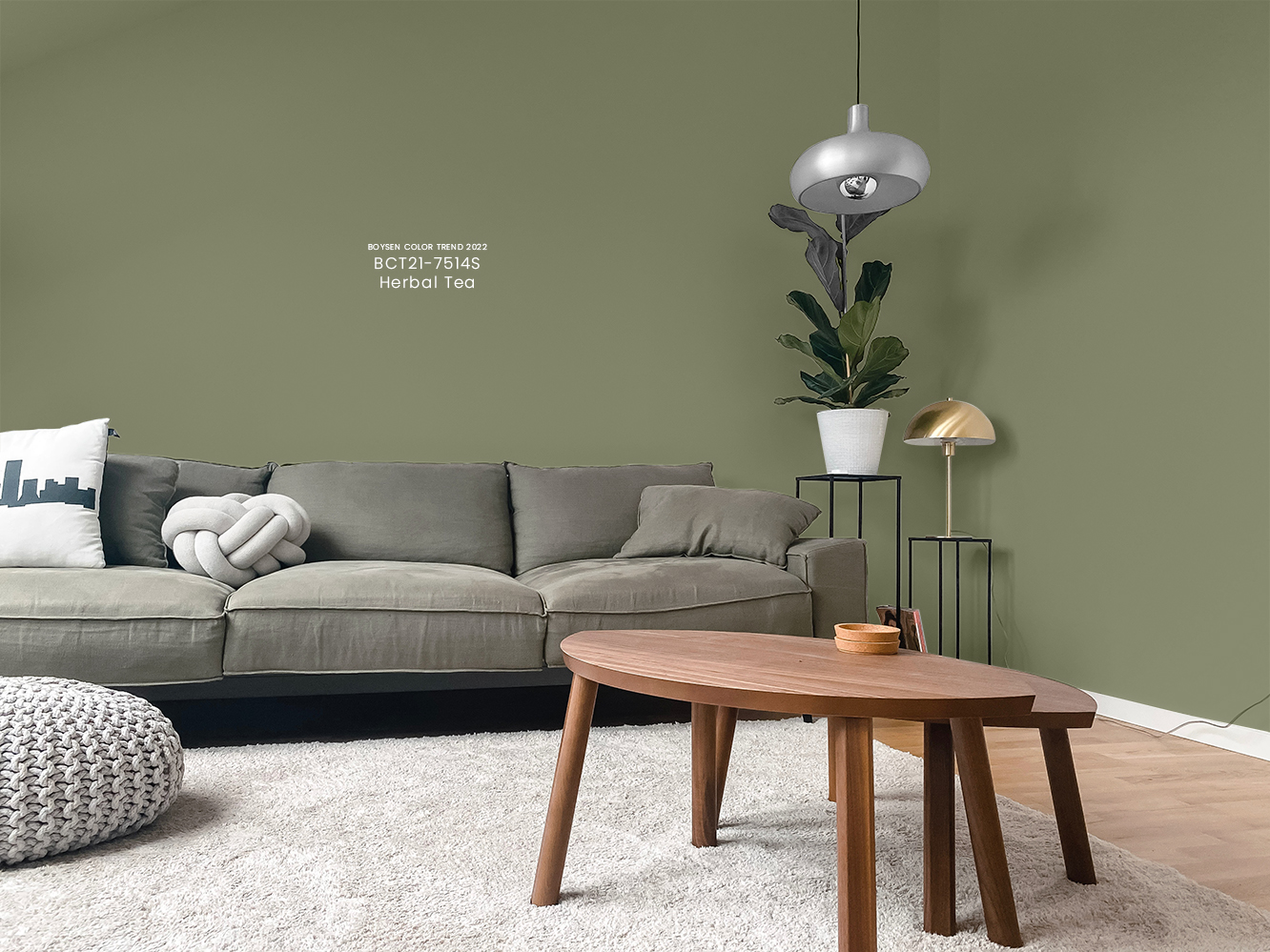
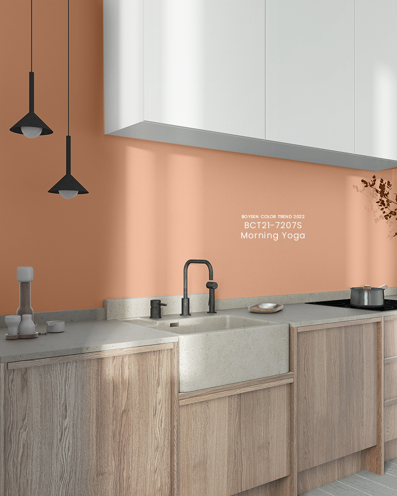
Japandi and the Breathe Palette
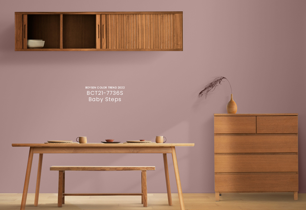
With that said, Boysen has just the palette for those looking to create a Japandi home. The Breathe palette from the Color Trend 2022/23 collection is made of six colors that together exude the kind of calm and balance one needs to relax and recharge.
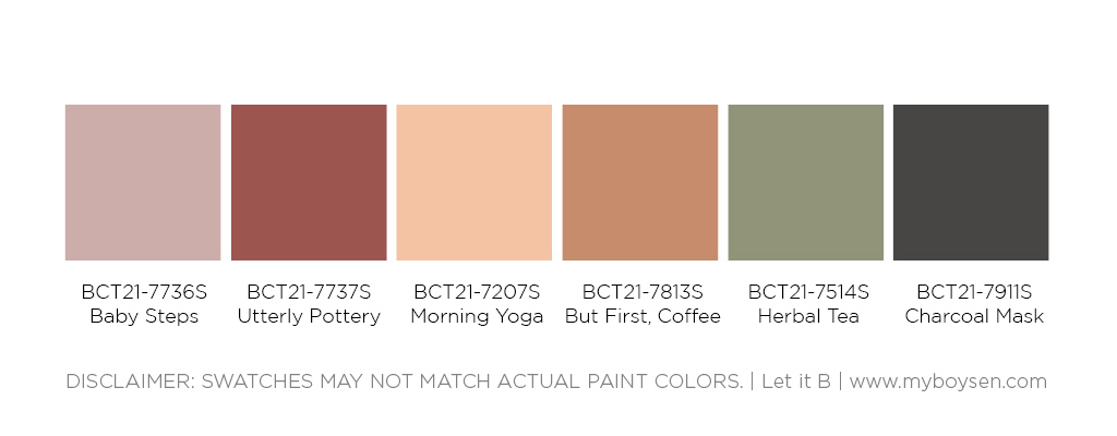
“Muted reds comprise most of the colors of Breathe. A mellow green and somber charcoal complete the palette,” says the Boysen Color Trend website.
“Using these gentle colors which are different from the usual greens of biophilia, you can create an eco-chic urban dwelling and fill it with decor made of natural materials. When the world gets too frenzied, retreat into this sanctum to catch your breath.”
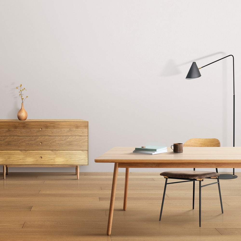
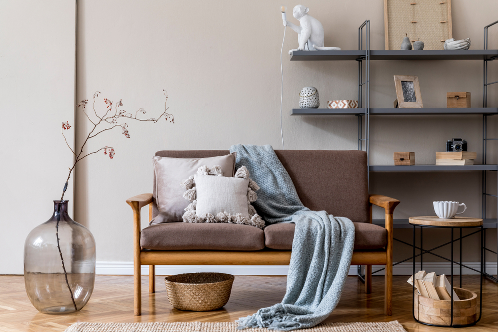
Need inspiration? Check out these Japandi interiors that make use of the Breathe palette.
Create your own sanctuary and consider going for Japandi interiors. Just remember: you’re aiming for minimalist and functional in natural materials and muted hues. You can also get all the colors in the Breathe palette mixed as paint for your home at a Boysen Mix and Match station near you (list of locations here).
Found this blog post useful? Consider subscribing to the Let It B newsletter for more decorating, color, and paint-related content like this one! For questions related to Boysen Products, feel free to reach out to the Boysen Technical Department at ask@myboysen.com. You can also call (02) 8363-9738 local 413 to 418.


