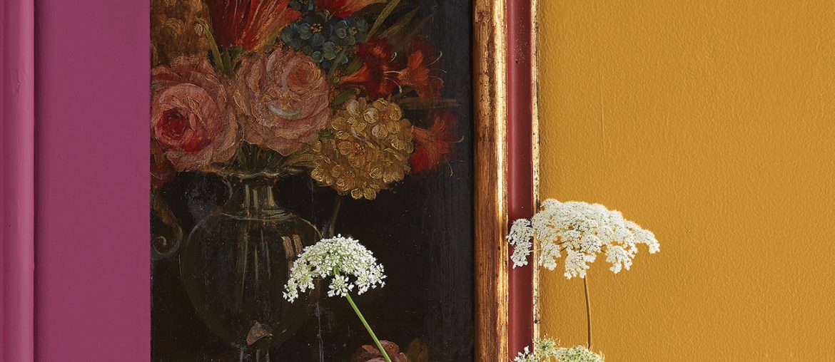
The BLOOM color palette of Boysen Color Trend 2022/23 is a happy and colorful one and made up mostly of warm colors pink and yellow. We’ve featured it so many times in this blog so for this post, we are going to show more than tell. Get yourself something cool to drink, sit back, relax, and enjoy watching these short video clips of the six paint colors of this palette. Think of it as meditation. If you can’t be with nature, let nature come to you…digitally.
Wistful Lilac | BCT21-7434S
Lilac is a trendy color but also one that was much loved by fashion mavens in 18th century England. Not only was it found in fashion but the lilac shrubs were also a mainstay in gardens. They flower during the early summer and have a fresh and tender scent. It may look delicate but it’s actually a hardy plant, and thus just like its color, symbolizes confidence and renewal.
Room where this paint color is recommended: This is such a restful hue that this could work very well on your bedroom walls.
Honey Hive | BCT21-7617S
A hive of activity—that’s what I think about when I see this color. It’s bright and earthy, not surprising if you think about bees. This color has dynamism and pep, that grounding energy we all need to start the day with. A shot of Honey Hive is enough to elevate your mood to face the day and go to work with that focus and purpose that drives you to achieve good and great things.
Room where this paint color is recommended: Paint an accent wall in this color in your kitchen to reflect the energy that a place for preparing and cooking food, an essential activity in any home, should have. For added zest, combine it with a bright yellow like Lemon Pop | BCT21-7618S found in the MOVE palette.
Teal We Meet Again | BCT21-7435S
Blue is usually viewed as a conservative and traditional color that is equated to serenity and calm. Teal We Meet Again, however, is an intense blue color. It provides more excitement because of its almost equal mix of green and blue.
Room where this paint color is recommended: Go for a vibrant makeover with this deep teal in the living room. The best thing about this color is that it can be matched with many other colors, which would then give a different feel to a space. For example, teal with white and you get a serene, classical vibe. Pair it with yellow like Honey Hive, and you get an eye-catching and interesting space. Combine teal with pinks like the ones we have in this palette and you get a soft and fresh energy. What about teal and orange? Yeah! Just like teal and yellow, teal and orange (like paprika or terracotta) give off vibrant vibes which is wonderful for a living room especially if you’re the gregarious type.
Whirlwind Romance | BCT21-7436S
As the name suggests, this color is all about passion and verve. When you live in a small condo, having this intense color on your walls may not be what most people would like to have. But for those who don’t mind to have this boldness in their living space, think about how to use it in your home. This deep red hue works in rooms where you need to raise the energy.
Room where this paint color is recommended: When interior designers say that red would look gorgeous in any room, we agree. But if you want to limit this color in only a room, then we’d recommend this color for the home office. Nowadays, working from home is gaining wide acceptance so this is the opportunity to have a beautiful and stylish home office.
Sweet Inspiration | BCT21-7437S
Sweet Inspiration is a pale purple color or mauve, which is very much in fashion today. This pastel can help create a joyful mood in your home without being too dominating. This is a classic and feminine color that’s not too girly. Colors that complement this hue are beige, taupe, gold, or a deep purple.
Rooms where this paint color is recommended: Instead of millennial pink or the popular blush, use the mauve of Sweet Inspiration for your bedroom. If you are lucky enough to have your own space like a She Shed, you can paint the place with this color.
Candies Be Love | BCT21-7738S
Candies Be Love is like ice pink but lighter. Pair it with Wistful Lilac or Sweet Inspiration for a space that exudes calm, grace, and a touch of romance.
Rooms where this paint color is recommended: This pink pastel is light enough to be an alternative to white and beige. You can use this paint color for the entire home . But if you don’t want to do that, you can paint north-facing rooms with it for added warmth. This beautiful, delicate pink can be dressed up with tawny gold, other metallic accessories, or pale yellow accents. If you want a crisp and fresh feeling, you can paint trims (like baseboards or door and window trims) in white.
BLOOM in the Boysen Color Trend Website
Nature is always a wonderful teacher for us to learn how to mix colors. Flowers, unlike animals, are good tutors because they don’t move so we can study them closely.
Visit the web page of BLOOM to see photo inspirations of how the colors in the palette are used in interiors.


