
Spring? You may ask what the heck am I talking about. We have no spring. It is not cool and fresh at all! I know. I know. Even at 6:30 in the morning, coming out of a cool home and going for a walk is like being engulfed in a heavy and damp blanket. But let’s not quibble about these things. Spring has sprung…in other parts of the world, and it looks so beautiful.
We also can have our own spring here in our MyBoysen world. Let it be. So here’s a light and bright video to get us all inspired. Enjoy!
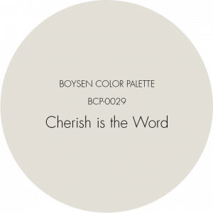
White is Light
Spring is about hope, new beginnings, fresh ideas, and newly minted plans. It is lightness, cleanliness, freshness, purity, and innocence. It is that time of the year where the air is redolent with the scent of flowers. You go about the day with a bounce in your step and love in your heart. This is why we have chosen this paint color called Cherish is the Word | BCP-0029.
Paint your house white inside and out, and for sure, you will get the feels of something new and exciting. Let the sun stream its rays into your home to bathe it with its energizing and cleansing light. Open the windows fully and allow the air to circulate so that stale and musty smells disappear. Do that spring cleaning to make your home happy and healthy, which will make you happy and healthy too.
Purple for Creativity
Spring is about creativity. When you’ve got all these hopes, dreams, ideas, and plans, you need creativity to be able to manifest them. How do you make the intangible tangible? How do you make your dreams come true?
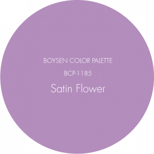
Paint Satin Flower | BCP-1185 on your walls. This is a wonderful color for a bedroom. Be at the peak of your creativity in the place where your dreams are born. Purple is a luxurious color, the kind of luxury that does not take itself too seriously. This purple is whimsical and fun. Creating things with this lightness of heart imbues your creations with joy.
A Place in the Sun
Spring would not be complete without the sun because it is the sun that coaxes the buds to unfurl their petals and explode in color. As Ralph Waldo Emerson said, “The earth laughs in flowers.”
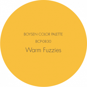
The yellow of Warm Fuzzies | BCP-0830 is warm and sunny. It’s that kind of yellow that makes you break out in smiles. This is a wonderful color to have in rooms where you would expect guests like the living room or the kitchen. Make these rooms feel like a warm, loving embrace.
Read The Happiest Paint Colors to Brighten Your Day.
Dark Coral Delight
The dark coral color is embodied in this paint hue called Sweet Baby Rose | BCP-1067. That name alone says it all. Nature is nascent during spring when shoots push out of a fertile earth and plants dress themselves up in stunning hues, some in this shade of red, which is vibrant but not too intense.
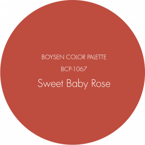
This color would look good in many places in the house. For many centuries and in many countries, coral is considered a lucky color, one that symbolizes prosperity. Imagine this color paired with a robin egg blue and you’ve created a gorgeous color combo that would make any space feel welcoming and lively. This orangey pink color also has a natural, organic vibe so if you love wood, then this is a great paint color choice.
Spring Green
Spring is green, the color of growth and renewal. It’s a cool and soothing color that rests the eyes. Lucky are those plant lovers who have gardens, or those who have made gardens inside their homes. No one can deny that plants are good for us. We have an innate connection to them so there is wisdom in welcoming these living things inside your home.
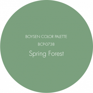
Spring Forest | BCP-0738 is a cool green that works best in places of rest and relaxation because of its peaceful vibe. The beauty of green is that it is versatile and can work well with many other colors. Green’s many shades can go well with white because the fresh vibe is intensified. It can make the room feel peaceful and calm. If you want to add some spice to the space, use red, orange, and yellow as accents. Or use home accessories made of metal to give the room more sparkle.
Read about other cool greens like olive.
Blue Serenity
As with green, light blue also exudes the air of peace and calm. Not surprising since green and blue are adjacent colors, i.e., they are next to each other in the color wheel.
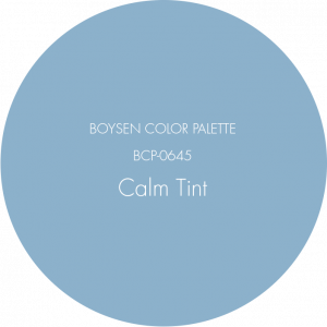
Calm Tint | BCP-0645 is, as its name indicates, a tranquil and healing hue. A home painted in this color would be perfect for someone who wants a quiet and restful home. It is a classic color that can look good in many interior styles. If you are thinking of repainting your interiors, then this color is a good choice to make your home resonate with a healing energy.
Spring Colors
Consider these spring colors to paint your walls with if you want to do a home makeover. You can never go wrong with these nature-inspired colors. There are actually more. Click on this link if you want to explore further.
Excited to see any of those colors for real? Go to any of the Boysen Mix and Match stations. Check this list to find out what location is closest to you.
There will always be differences in the colors of digital and physical paint swatches. Find out why here. Please bring the paint name and code, and ask to see the Boysen Color Palette fan deck before you put in your order.
Happy spring painting!


