Spring has sprung in other parts of the world. In my FB newsfeed, I see friends’ photos of colorful flowers and verdant landscapes. I felt a tinge of nostalgia for this beautiful season in temperate regions—its freshness, greenness, and outright optimistic air with the trees sprouting and flowers blooming.
While I was out for my early morning walk, I reminisced about the springs in one of the most beautiful cities in the world that I called home for nearly two decades. Spring was usually a burst of color, even in a tiny stoop. That was no surprise since I lived in the flower capital of the world. People loved their flowers and planted them wherever they could, including plant boxes on window sills.
Lost in thought about past springs, I happened to look up and saw this fire tree profusely blooming just because it is its nature to flamboyantly burst into flames during this time of year.
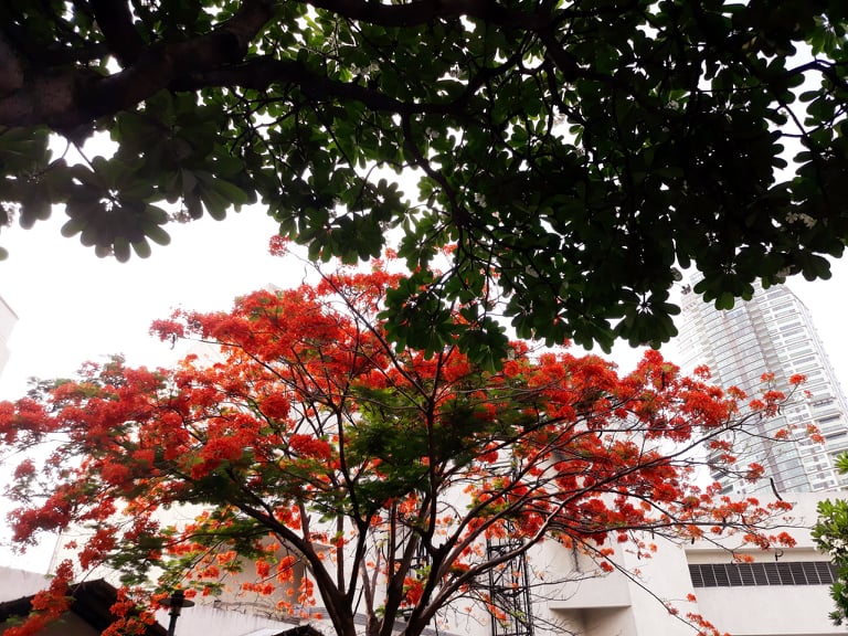
That stopped me in my tracks and brought me back to the present. It was as if the tree was saying to me, “Hey, wake up! I’m here!” Spring has sprung too then, Philippine style. The weather here may be hot and humid but the feast for the eyes is definitely present too.
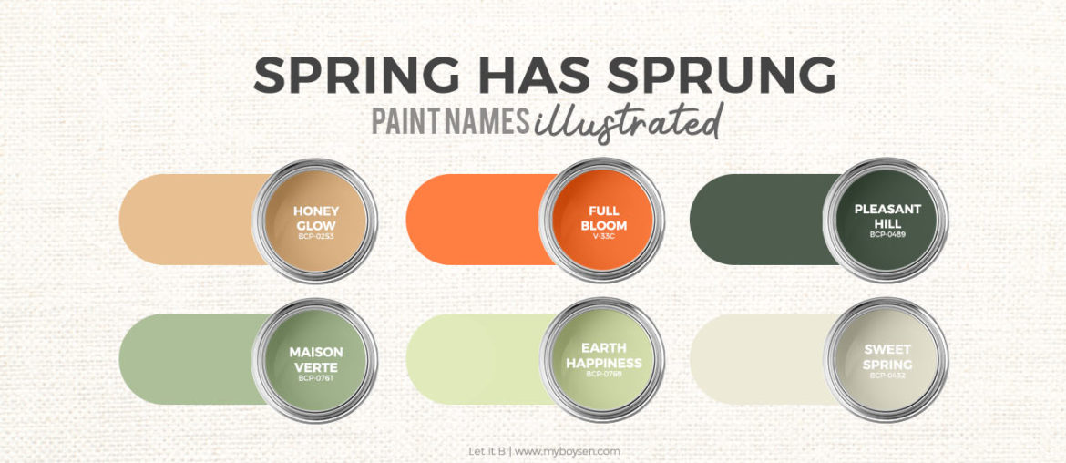
This colorful sight made me of an article that Mirz (our dakilang artist) and I have been working on. Seeing this fire tree was synchronicity at its finest. I wanted to have illustrations of six Boysen paint names. The paint colors, which were similar to the colors of the fire tree, had been carefully chosen so that anyone using the palette is assured that choosing two or more colors will work.
The Muted Shades of Spring
Muted greens, earth colors, a dash of spice—this paint color palette is our spring offering to you. No need for many hot hues these days. We have an average daily temperature of 35°C, humidity of 70% (a comfortable level is 40%), and an extreme UV index.
Honey Glow | BCP-0253
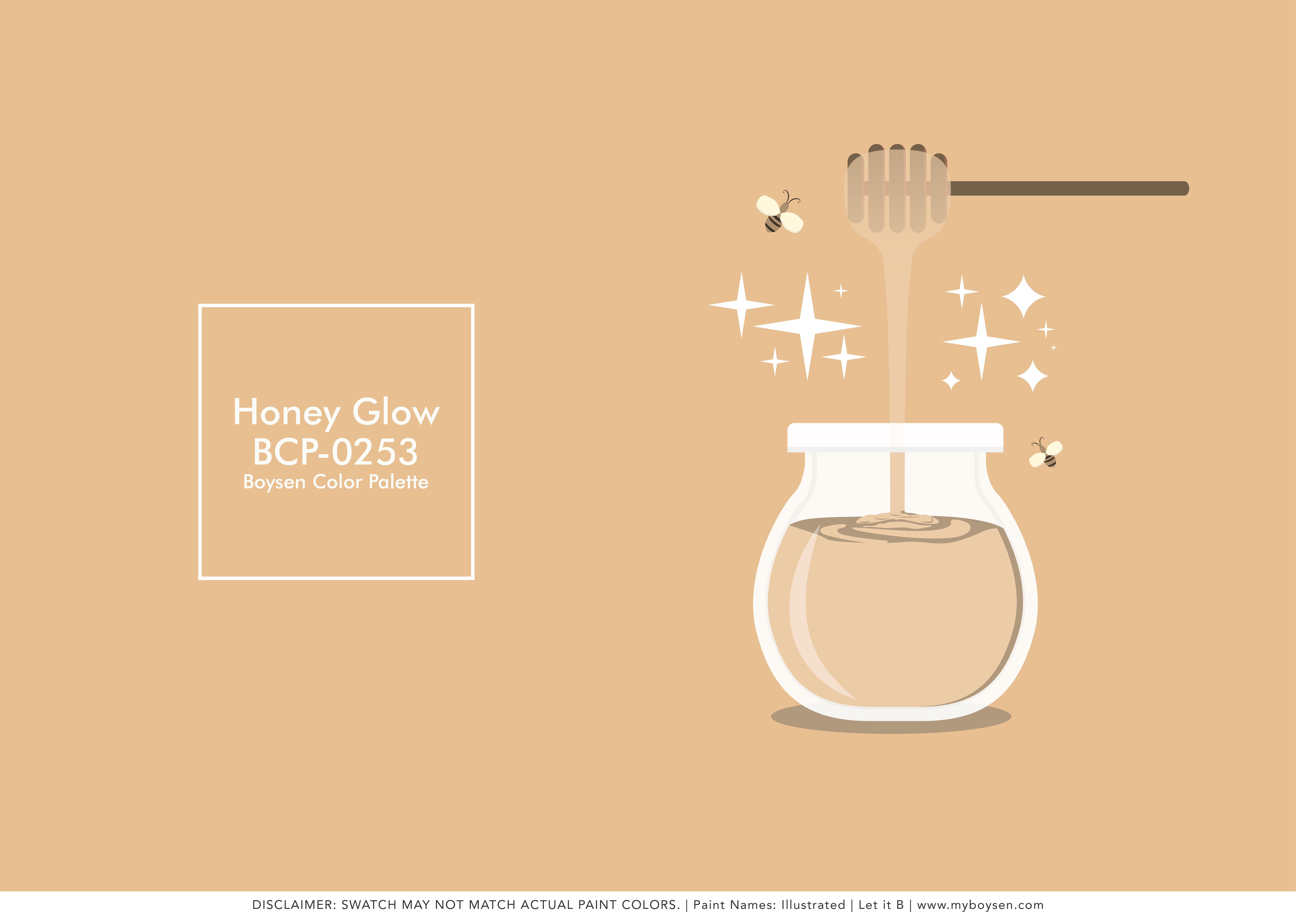
Honey Glow would be classified as an extra light amber in honey terms. Its subdued light orange-brown hue can bring a soft warmth to a room. Color changes when the light changes. Use this color in rooms located in the south side of the house to get this glow.
Full Bloom | V-33C
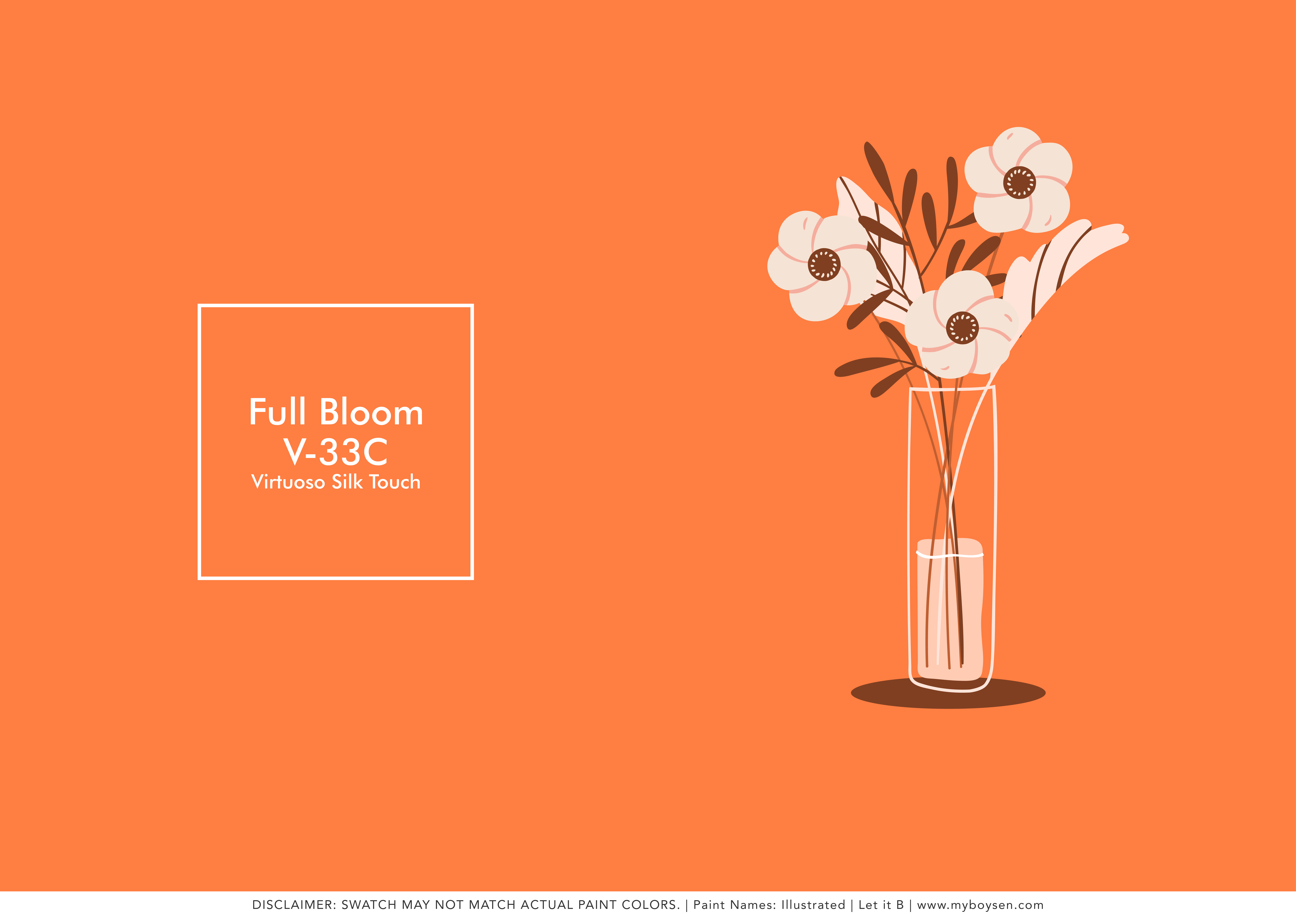
Full Bloom is a cheerful orange that would provide a quick pick-me-up to a space. For those of you who do not feel confident about using this color, you can always opt to use these for your soft home accessories, like throw pillow covers. However, this orange is such a part of our traditional weaves, as well as the color palettes of our fiestas. The Filipino soul is no stranger to this passionate and pulsating hue. It may be time to explore your boldness.
Pleasant Hill | BCP-0459
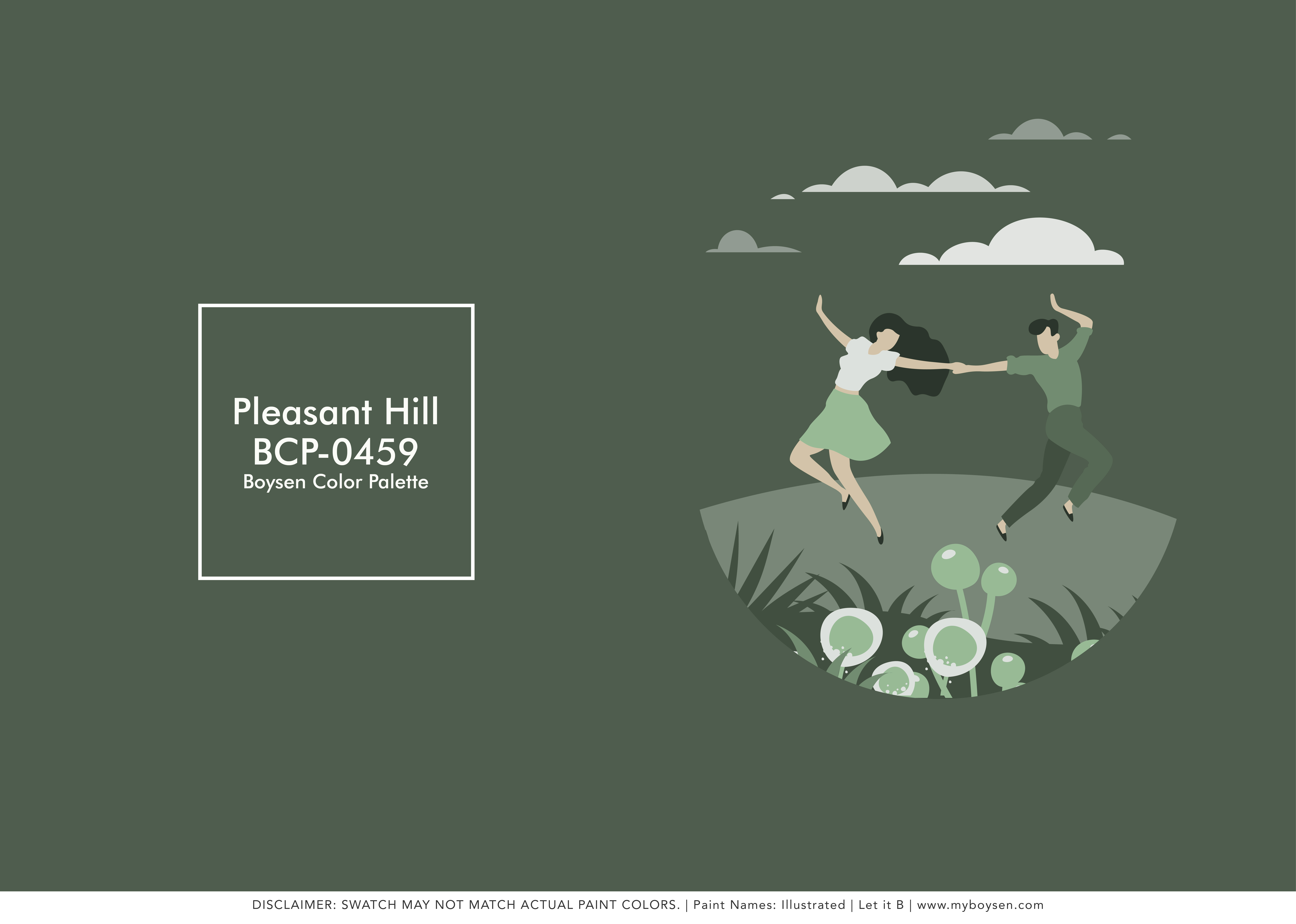
Pleasant Hill is a dark, grayish-green color, like leaves in the shade. It is the color of pine trees in Baguio at dawn or at dusk. This very deep, cool color can be a good backdrop for brighter hues, and would look cool and sophisticated paired with gold or silver accent pieces.
Maison Verte | BCP-0761
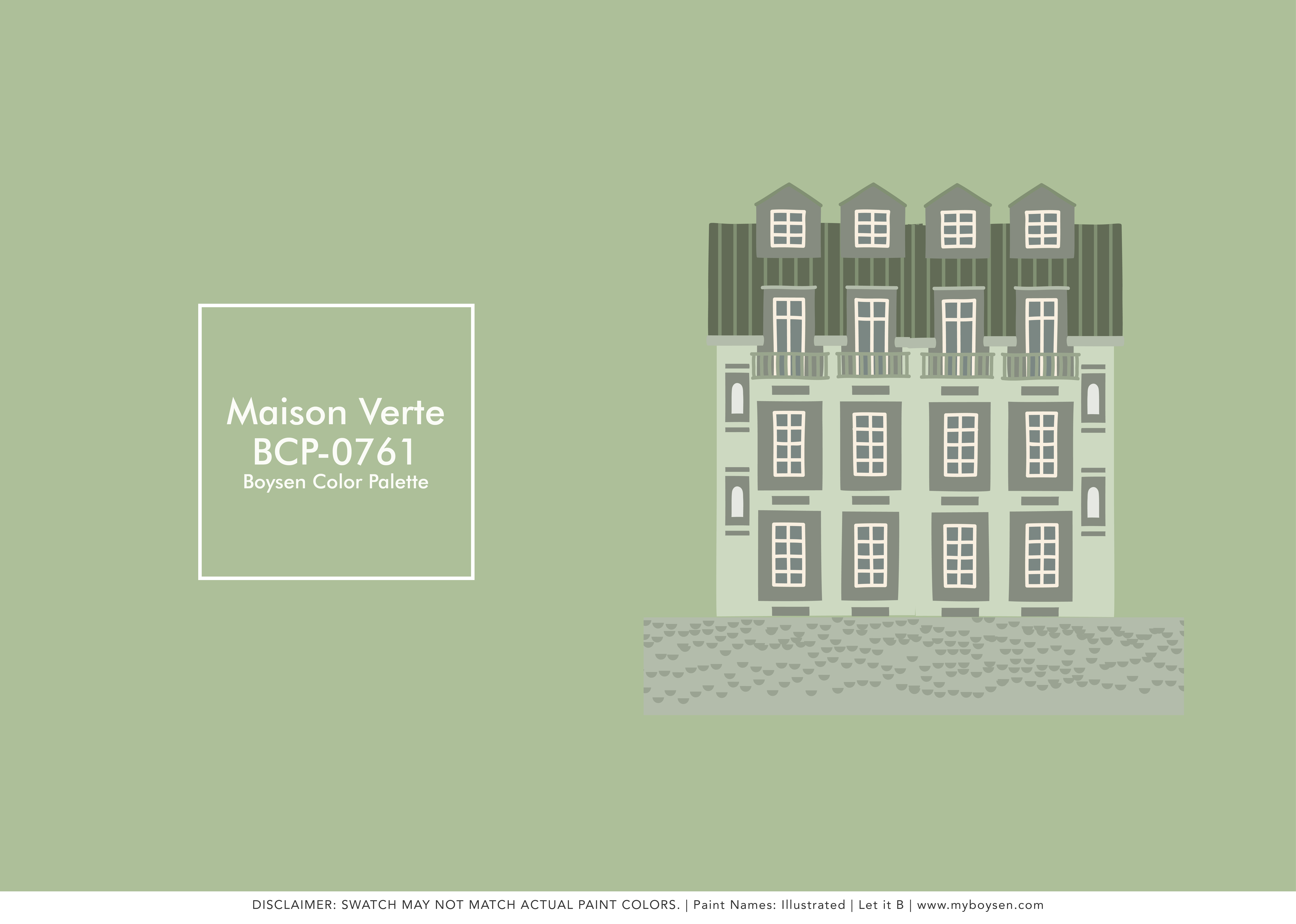
Maison Verte is a pale green that is found during spring as the plants push out from the once-sleeping earth. Or they are the color of tender shoots of trees that are beginning to dress themselves again. This light, pale pastel would look good on your walls. You needn’t be afraid to paint this on a big surface area.
Earth Happiness | BCP-0769

Earth Happiness is aptly named. It is a happy color, all bubbly and light with its hint of yellow. This color is slightly warmer than the subtle Maison Verte. But both look good together with the dark Pleasant Hill to anchor them. If you are going for a monochromatic color scheme, these three colors would look very well together.
Sweet Spring | BCP-0432
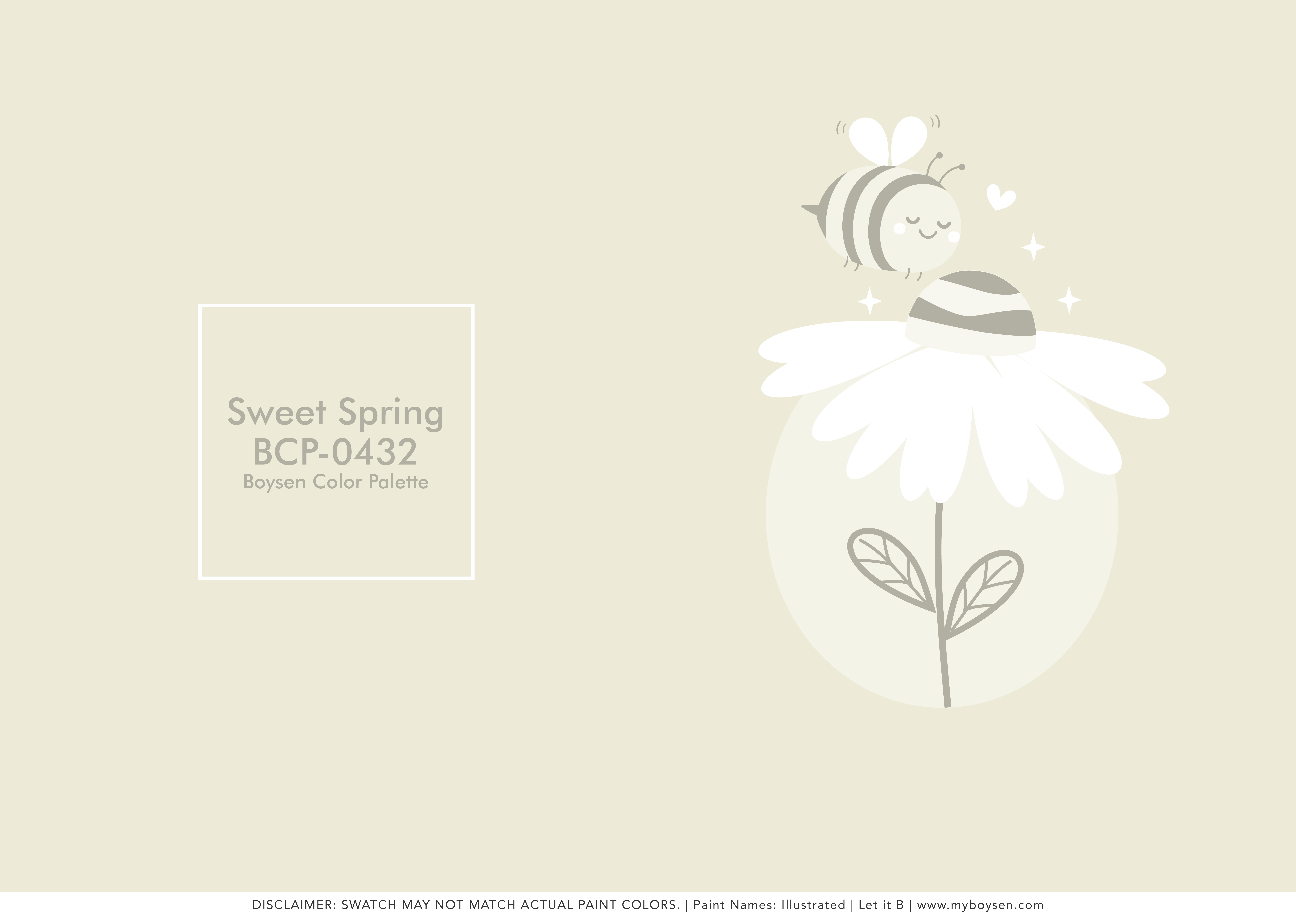
Sweet Spring is the last one in our six-color palette, and it is also the lightest. This color is a light neutral that can also take the place of white if you want a softer option.
Photo Inspos
View this post on Instagram
View this post on Instagram
If the orange color is too much for you, you can use it on your furnishings, like sofas, chairs, pillows, or throws. As long as there is a hesitation on your part to use bold colors on your walls, then don’t do it, unless you are ready to experiment and know that if it doesn’t work, you would be willing to repaint your space with a color you consider safe. If you like it, then that’s your personal growth. If you don’t like it, that’s time, effort, and money wasted, but at least you can be more sure now about what works for you and what doesn’t. Think of it not as a mistake but as the cost of learning.
Usually you would already know if you are the type to like vibrant colors around you. Just look at your wardrobe. What hues you choose for your clothes are, more often than not, the colors that you would like to have in your space.
View this post on Instagram
This is one of my favorite exterior spaces in IG. It may be small, but it is cozy, fun, private, and it is outdoors, which is a wonderful home extension to have during this very long quarantine. But pandemic or not, this type of space is helpful for your well-being as well as increases the value of your property.
Paint Color Palette: Spring Has Sprung
We hope you like the Spring Has Sprung color palette as inspired by a blooming fire tree somewhere in this megacity of ours.
We usually have a disclaimer for the color swatches that you find in our social media channels. This is because there are so many factors that could change your perception of the color, like light (artificial and natural), the gadget you are using to look at the color swatches, the material or surface it is applied to, or even the neighboring colors. Read The 3 Steps to Get the Closest Color Match. The best thing to do if you are ready to (re)paint your home is to visit a Boysen Mix and Match Station to see the color swatches available.

