
Do you belong to Team Neutrals or Team Colors? You don’t have to be super self-aware to know the answer. Just look at your wardrobe, the things you consider precious, your home, your car, the places you would like to visit, etc. Now that #teamputi, #teamkahoy, #teamindustrial have been making themselves heard over the last years, maybe it’s time to ask ourselves if we belong to any of those or should we coin more hashtags—#teamneutrals and #teamcolors?
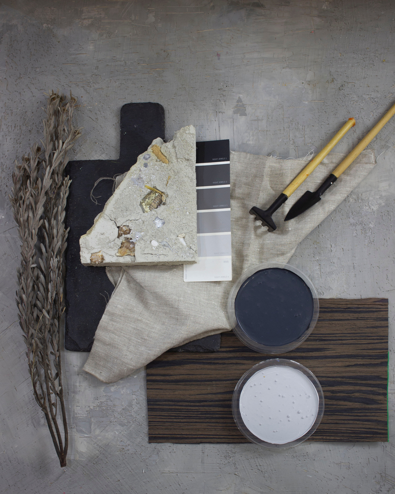
Light and Dark Neutrals
Neutrals, whether light or dark, are friendly, easy on the eye, cool, charming, laid-back, subtle, sophisticated, chic, reserved, elegant, flexible, classy, refined…in other words, sugar and spice and all things nice. Most homeowners go for neutrals. You can hardly go wrong if you paint your house in any of these colors.
Neutrals are a darling of people who love the minimalist or classical styles. When textures and patterns become as much a part of the equation as colors, one can create a home that exudes a distinctive sense of style and sophisticated ease.
In the hands of amateurs, the neutral palette may also make a home that could look cold, boring, bland, uninteresting, even depressing. To avoid that from happening, you can bring in an interior designer if your budget allows for it. If not, read about the 7 elements of interior design, and see how you can use the different elements to your advantage.
Neutral Paint Colors
Boysen offers so many neutral colors. For the whites alone, the Boysen Color Palette fan deck has 32 off-whites you can choose from. There are also the creams, browns, beiges, grays, and blacks that offer so many options. Keep in mind the undertones of the colors you will be choosing. Make all colors in the palette have either warm undertones (orange, yellow, or red), or all cool (green, blue, or purple).
Read about warm and cool colors by clicking on this link.
Team Colors
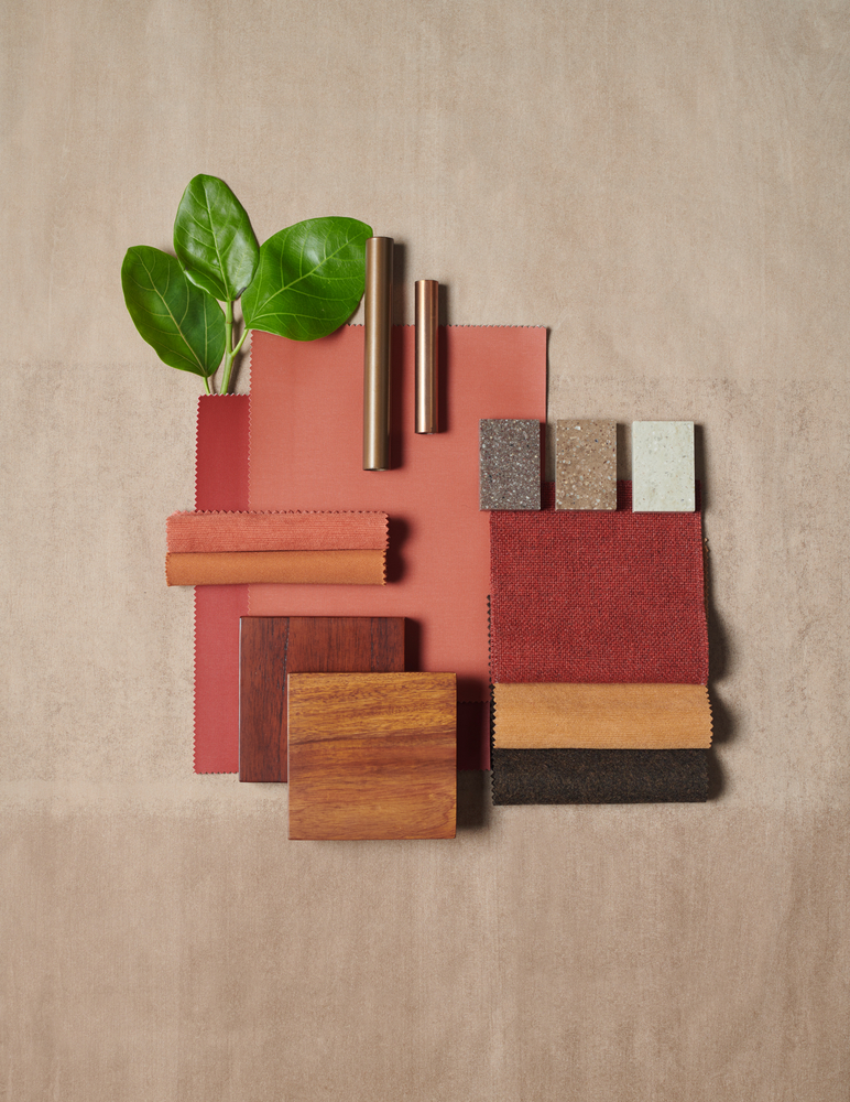
Colors are exciting. Colors express emotions. Colors can make your home glow like a gem. OR NOT.
It is that “OR NOT” that prevent most people from diving into a world of color. That, and the need to be safe about choices. Safe in the sense that neutral colors are the norm, therefore, more acceptable to most people. Especially if you are thinking of selling, neutral paint colors on your walls and other surfaces are your best bet to get the property off your hands faster.
But if it is a home that you intend to stay in for the foreseeable future, now is your chance to let your heart speak and to express yourself in your home through the use of paint colors. We live in great times for that option because thousands of colors are within easy reach, unlike centuries ago when pigments were rare or so expensive that only the rich could afford a certain hue.
We often get questions from readers about what’s the best color for their home. We cannot, in all fairness, give you a recommendation because color choice is highly personal and only you can answer that question. The best thing we can do at Boysen is to offer you color palettes that have been calibrated so that the colors in a palette work together. Visit the Boysen Color Trend website and trawl through many color palettes that we have curated since 2015.
Things to Remember When Choosing Colors
Pantone defines color “as the aspect of things that is caused by differing qualities of light being reflected or emitted by them. To see color, you have to have light. When light shines on an object some colors bounce off the object and others are absorbed by it. Our eyes only see the colors that are bounced off or reflected. The first person to discover the link between color and light was scientist Sir Isaac Newton.”
1. Paint Sheen
Light is important for color to be seen in all its glory. Paint sheen is therefore an important element to consider when you choose your paint. Read this post to understand paint sheen much better. Do click on the links you see in the article so you will know more how to choose the type of sheen you will have for your surfaces. With color being equal, there is a difference as to how it would look if the paint coating is matte or gloss.
2. Color Undertones
If you were into makeup, you would understand what “undertone” means. If you know your skin undertones, you’d be able to choose what shade fits your skin better—warm, cool, or neutral.
Paint colors are a mix of different colors, like red and green would make brown, or blue and yellow would make green. To make it more interesting, paint colors can come as a mix of more than just two colors. Also, percentages of each color would change the overtone, or the color that you see.
Usually, undertones can make a color look warm or cool. Warm undertones would be red, orange, or yellow. Cool undertones would be green, blue, or purple.
3. Natural Light
Where your room is facing (north, south, east, or west) impacts the paint color that you choose. This post, How to Pick a Paint Color Based on Where Your Room is Facing, teaches you how to pick the color based on where your room is in the house. This is because sunlight characteristics differ with the room orientation. So do read the article because it is very helpful in your decision-making.
4. Light Reflectance Value (LRV)
Don’t let this technical term Light Reflectance Value (LRV) throw you off. It just means that a surface absorbs or reflects light, and paint color has a great impact on LRV. What you need to know is that architects and interior designers usually pick a paint color with an LRV of at least 50%. For darker rooms, they suggest to choose an LRV of 65% or higher.
How do you know the LRV of your paint color choice? Easy. Just look at the back of the Boysen Color Fan Deck and you will see the LRV for each paint swatch.
Explore Colors
If you had been wishing to have a more colorful home, don’t be held back by what’s considered normal or middle of the road. Many times it is getting out of the beaten path and making your own that brings you a home that expresses who you are. As we said in Color Trend 2015, “Explore. Experiment. Express yourself with colors.”
Need more color inspirations? Subscribe to Let it B.


