
Yellow is an eye-popping, zing-tingling, gut-punching shot of pure energy. It doesn’t really matter what tint, tone or shade it is, it just grabs you – whether it’s the airy lightness of cream, the fluffy brightness of lemon chiffon, or the vigorous sharpness of mustard.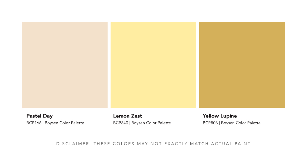
Cream of the Crop

Who doesn’t get attracted to berries and cream like in this oh-so-delicious yoghurt panna cotta that I made ages ago when I was so into cooking and baking? No modesty here based on experience from many guinea pigs who devoured this dessert.

What about hot chocolate with whipped cream on top? I know some people who even want more cream! Just even thinking about it makes my balakang grow even bigger.
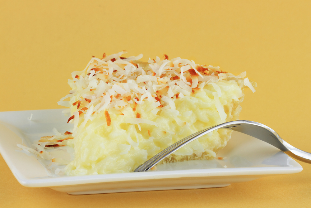
Or this coconut cream pie?
Unless you don’t like sugar or desserts like a friend of mine, I’m sure there’s a temptation to tufts of cream piled high over a cup of chocolate or coffee, or swirls of cream icing a cake, or jello-ey panna cotta made from scratch flavored by fresh vanilla pods!
Create Your Own Sunshine
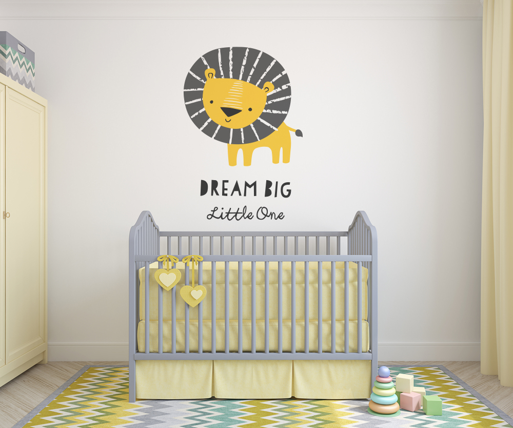
My heart melts when I see the pastel colors that are usually used in nurseries. The yellow is light and breezy with a very soft glow. It entices you to come in and reach out to share in that warmth, and cuddle with the baby, if that’s allowed of course.
View this post on Instagram
How’s this as a warm welcome the moment you step in the door or as a light kiss when you leave home? The light yellow walls are balanced perfectly by the wooden floor, the robin egg blue door and the black lines of the painting. The griege ceiling molding also ties the room together. Capping it off is the white ceiling which makes the space very airy and bright.
The Boldness of Mustard Yellow
Carla Velvet Armchair by Amelia Widell
Mustard is a trending color in the recent exhibition of Salone del Mobile.Milano (April 9-15, 2019). In this House Beautiful article, even Pinterest thinks that mustard is so hot right now.
But back to Milan.
Several designers have used this bold mustard color in their furniture.
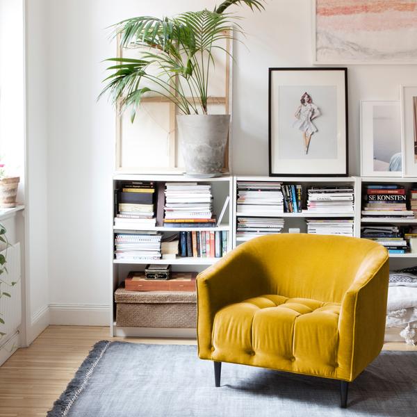
Above photo is the Carla velvet armchair, a luxurious and stylish talking piece designed by Amelia Widell, a Swedish furniture designer and founder of MELIMELI. It’s color is said to be amber instead of mustard. Both are dark yellow.
This is a classic design but it can fit in any modern interior style too. I never considered having velvet for a sofa. But that texture and soft padding can make this a wonderful addition for any home, not one with children of course because velvet cannot take spills.
P3 Lavinia by Marta Sala Editions
Italian furniture design house Marta Sala Editions collaborate with architects Lazzarini and Pickering. They created these two pieces of furniture in 2016, the P3 Lavinia Exagonal Armchair and the P3 Lavinia Exagonal Pouf.
View this post on Instagram
A serious and talented furniture designer’s intention is to make furniture that can last for years or decades, and that can be passed on to the next generation. This is why these furniture belong to today just like the moment they were created.
Marta Sala’s design aesthetics can be seen in this interview.
Yes pieces look like timeless and I suppose it’s what we call culture. Marta Sala Editions is the results of Lazzarini & Pickering’s knowledge, top select craftsmen and my heritage. That’s the raison it all feels so Italian; it’s definitely part of Italian culture and heritage and ethic.
…
We are very spoilt around Milan; we have this unique combination between handcraft and technical support that gives an incredibly high standard of quality without losing the sense of soul achieved from human application on each piece. You can feel it when you see pieces in real life. I take care personally with production because I know exactly what I want and how to optimize architects and craftsman’s knowledge.
– Marta Sala, Source
Cyndia Harvey’s Mustard Door
View this post on Instagram
Here’s an apartment in South London with a mustard door and full of flea market finds, mostly 70s furniture. What I love about this space is its uniqueness. You can already see the personality of the owner with the things you find in her apartment. You can also feel her confident hand behind the design choices of furniture and colors.
That’s mustard right there. It’s a color known for its boldness and zing. It’s definitely not for the timid. I cannot imagine a whole room with this as a dominant color though, at least not for me. I’d run out the room electrified!
But I do love this color! I’ve got cushion covers and clothes in this pungent shade. It’s not a color for wallflowers so if you intend to look understated and elegant, forget mustard. You can look elegant with it but definitely not understated. If there’s a color that calls attention to itself, then it’s this. If you’re not paying attention, it can just reach out and slap you in the face!
The Best Version of Yellow
So what’s the best version of yellow? Easy! You decide! We’ve just given you three here. There are so many versions to this hue, and you’ve got to pick one out for yourself. We’re just making it easy over here to show you light, mid-tone and dark.
The only thing to remember about yellow is that it energizes a space and makes it sparkle. If you want your home or a room to be light and bright like breezy summer days, then yellow is a great color to splash on your walls.
Color is a very personal choice. Look at your clothes, do you ever wear yellow? If yes, what shade? Then you go on from there. Trawl the internet and get those images with yellow interiors that instantly appeal to you. Study them and find out what makes them attractive. Make it fun! This is not a serious course in philosophy. ?
Tip: Be careful with your choice of yellow because it can look acidic. If it makes you look jaundiced being surrounded by it, then don’t even think about going there. But if you love it that much, you can either use it as an accent color, you can go lighter, or you can adjust the intensity.
Check out other colors in the best version of hue.


