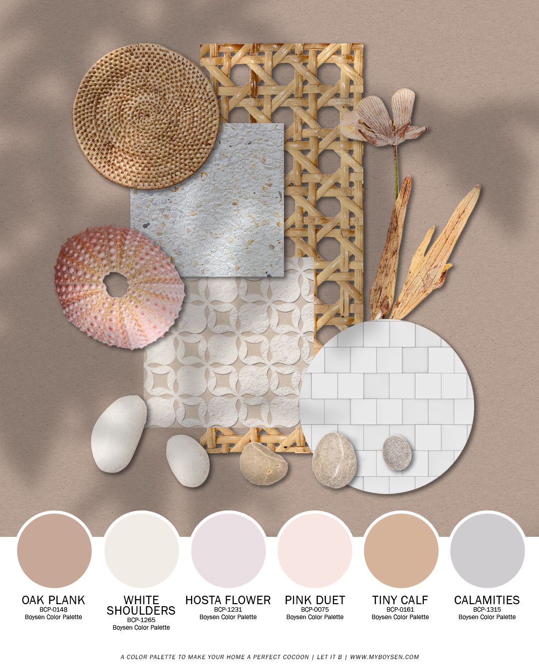
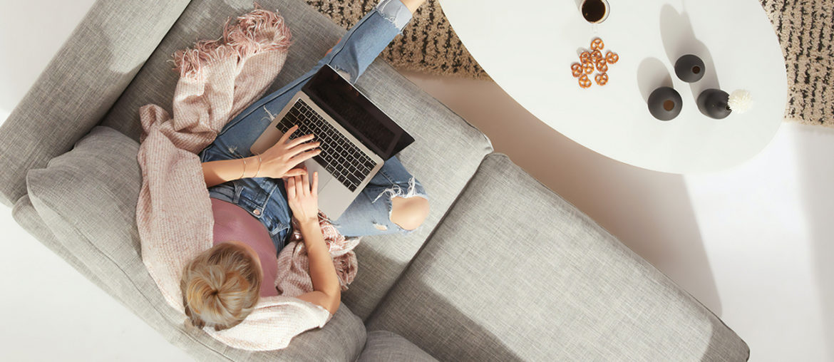
The changes that are happening around us demand from us a greater flexibility, creativity and resilience to survive these times. More than ever, we need our homes to become our sanctuaries, a place where we find relief, comfort and renewal. We offer you this color palette to make your home a perfect cocoon.
A Warm Color Palette for Cocooning

Think sun-kissed skin, balmy breezes, sun bleached corals and stones.
Soft, light, warm and natural—just a few words to describe this palette. Aside from the subtle, gentle colors, the mood board also shows what materials can be combined to bring out the magic of the palette.
Combine these colors with the artisanal weaves from our different tribes, driftwood colors, white-washed or other light wood, terrazzo tiles, ceramic tiles from Vigan, Machuca and other local brands. What also goes well with this palette is the concrete look which you can achieve using Konstrukt.
Different Architectural Styles
This color palette is versatile and can fit many architectural styles like a chic condo, a modern villa, and even a weekend beach cottage.
Here are some design inspirations using similar colors in the palette above. You can achieve subtle changes when you combine colors differently, as well as use different tints and tones of the colors.
New Colors for Exteriors
In the Philippines, exteriors are usually painted white, beige or grey.
With the palette, you can increase the curb appeal of your home by using another color for your home exteriors, which is still neutral and would work very well with any landscape. Try Oak Plank, Hosta Flower, Pink Duet, or Tiny Calf and give your exteriors a warm glow.
View this post on Instagram
View this post on Instagram
Dreamy Bedroom Colors
Focus on your self care and infuse your bedroom with warmth and comfort by choosing this palette to decorate your walls and furnishings.
Whether you go for modern interior design, or for a Scandi rustic feel, get a much-needed break and slide into hibernation mode during weekends. Have some rituals that help you relax like taking a warm shower or keeping a gratitude journal.
Court those sweet dreams with silky sheets and soft pillows. Let the nights melt your stress away so you wake up feeling re-energized.
View this post on Instagram
View this post on Instagram
Comfortable and Cozy Living Rooms
You don’t have to limit the colors to your walls. Use the color palette for the whole room, on soft and hard furnishings. Sometimes even the cats can provide the color accents.
We are in our seventh month of quarantine so most probably many of us are done with the phase of rethinking spaces, like changing layouts to accommodate the additional demands (work and online learning).
The color palette is a great tool to use for color blocking, which can demarcate spaces in an open area or provide interesting wall features. Because the palette is almost monochromatic, you can achieve a harmonious look that could give the illusion of a bigger space.
View this post on Instagram
View this post on Instagram
View this post on Instagram
Kitchen Fab
Hardworking kitchens can also look soft and pretty. All you need to do is to exert your personal style on your kitchen space. It does not matter if you have a big or a small one. Size is not a limit to style.
View this post on Instagram
The first one is small and has closed cabinetry which can be used as storage space to hide the clutter. Create a spacious feel with the color palette.
View this post on Instagram
The second one is whimsical glam with fluttering feathers wrapped around the pendant lamp shades, white and pink marble, and gold metal accents.
View this post on Instagram
This kitchen is a calm space with its white walls, grey countertop, and light wooden cabinetry. The statement piece is the huge brass pendant lamp that brings the vibe up a notch.
Wanna read up some more on more color inspirations for the home? Subscribe to this blog.


